Cheflix
Overview
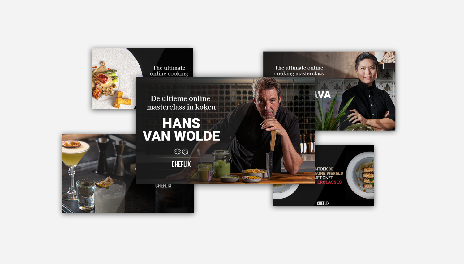
I'm the lead designer of this project. Designing an original landing page for a culinary streaming platform. This page is built from scratch to convert food lovers into subscribers, with full policy compliance and responsive UX. Cheflix is now live in the UK and the Netherlands. Apart from the landing page, I also designed creatives for Google Display and Native ads together with creatives for social media.
Project :
Cheflix
Role :
UX/UI Designer (Concept to Final Build)
Project Type :
Cooking Masterclass Landing Page
Platform :
Web (mobile-first responsive design)
Focus :
Conversion, storytelling, credibility, and compliance
The Challenge
Cheflix is a subscription-based culinary streaming service offering exclusive cooking masterclasses from world-renowned chefs. The client needed a dedicated promotional landing page to support targeted campaigns, especially in English-speaking markets like the UK.
The challenge was to design a page that :
- Clearly communicates the value and exclusivity of the masterclasses
- Encourages immediate sign-ups
- Balances aspiration with accessibility (gourmet but approachable)
- Ensures compliance with Google Ads policies
- Functions seamlessly on mobile and desktop
Objectives
- Establish a strong hero message with high visual impact
- Showcase celebrity chefs and premium content
- Highlight unique selling points: unlimited access, easy-to-follow classes, Michelin-star chefs
- Drive trial or paid sign-ups with clear CTAs
- Build trust and transparency (cancellation info, policy links)
- Ensure mobile-first design with performance in mind
Studied direct competitors like :
- MasterClass
- BBC Good Food Premium
- YesChef
- Tasty (BuzzFeed)
Key insights :
- Hero visuals are chef-focused, not product-focused
- Users respond better to video teasers and credentials than generic cooking imagery
- Visual storytelling is key, show emotion, passion, and taste
UX Strategy & Wireframes
Information Architecture Overview :
- Hero Banner – Impactful headline, top-tier chef image, CTA (“Enjoy 14 days for free”)
- Chef Highlights – Scrollable carousel or static grid with chef names & achievements
- Key Features – “Watch anytime”, “Cook at your pace”, “For all skill levels”
- Video Previews – Short teaser section for engagement
- Transparent Pricing & Cancelation Info
- FAQs & Legal Links
- Sticky navbar for easy sign-up
I sketched mobile-first wireframes to define the structure and flow, with attention to emotional triggers and credibility points.
UI Design Approach
Visual Themes :
- Premium meets approachable: Neutral palette with accent colours from food photography
- Typography: Serif headlines for elegance, paired with clean sans-serif for readability
- Chef Imagery: Full-bleed photos with subtle gradients to maintain focus
Conversion Focus :
- CTA Buttons: Bold and repeated across sections
- Chef Trust Markers: “As seen on Michelin Star TV”, recognisable chef names
- Legal Transparency: Pricing details, no hidden terms, footer links aligned with ad guidelines
Design Review & Developer Handoff
In this project, I was responsible for the start to finish, so i was the one designing, and developing the landing page.
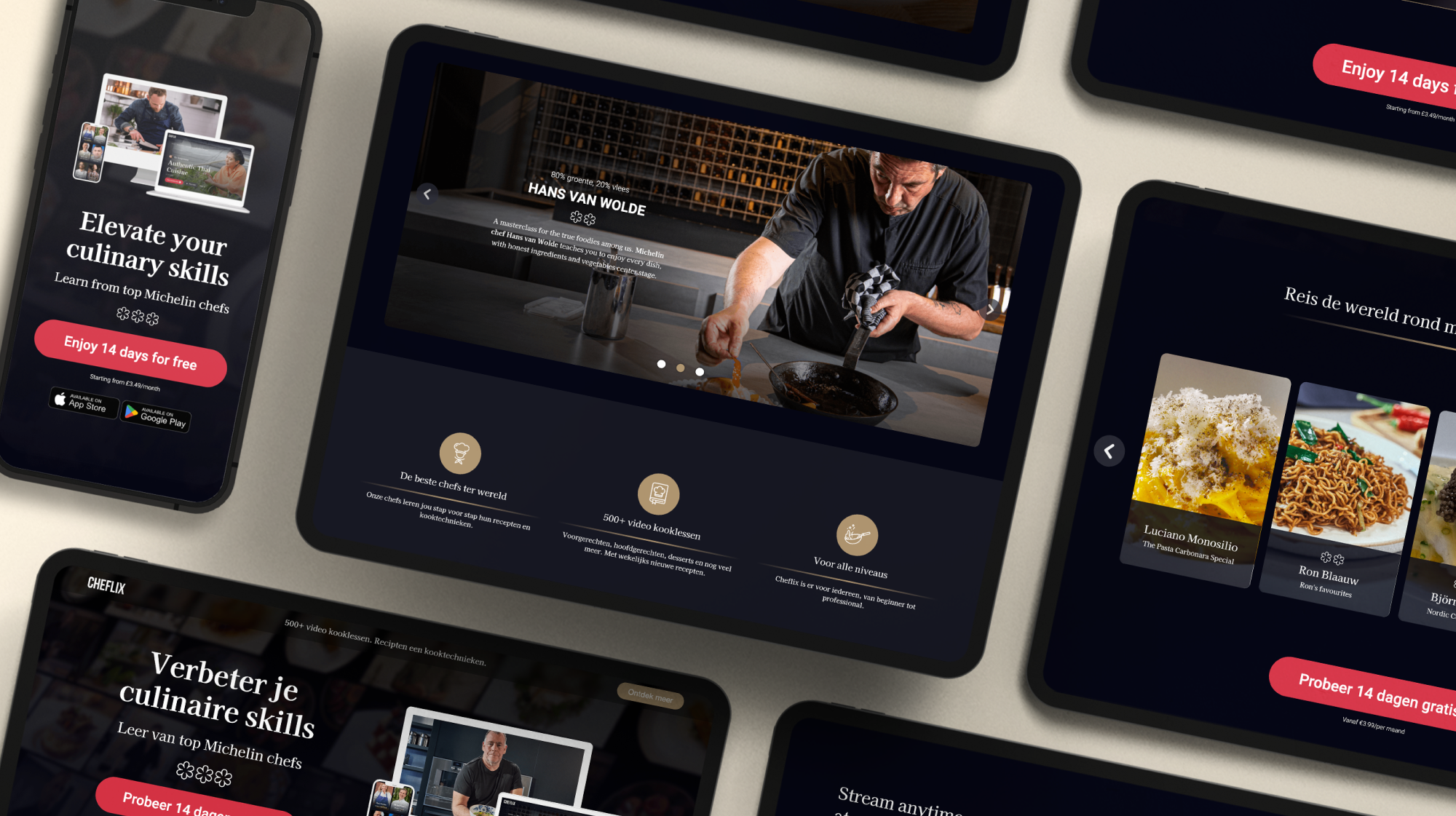
Final Design Overview
Cheflix is a subscription platform where Michelin-starred chefs teach video masterclasses, built as a cross-channel system that holds across web, app, and paid ads. Every surface locks to the same primitives: a serif headline mixing roman and italic for emphasis, a coral CTA tied to the 14-days-free value promise, paired App Store and Play badges, and Michelin stars repurposed as a trust glyph. The dark cinematic palette borrows streaming-service grammar to position cooking as premium content, while gold iconography carries editorial quality. Component anatomy stays consistent from desktop hero to single-column mobile to fixed-ratio ad units, so the brand reads identically across every touchpoint.


Outcomes & Reflections
This design was part of a promotional campaign, and while metrics were not directly shared post-launch, the client noted:
- Positive response from both NL and UK ad campaigns
- High click-through and scroll depth on mobile
- Fewer policy rejections on Google Ads due to clear structure and compliant content
What I learned : This project reaffirmed how great design is about guiding the user through a story, from appetite to action, with no friction in between.