Scream Stream
Overview
A complete landing page and digital campaign for a horror movie streaming service, where dark UX meets clean conversion. I created a responsive landing page alongside campaign assets including Google ads, social media posts, and the logo, partnering closely with the marketing team to translate their concepts into a cohesive experience.
Project :
ScreamStream
Role :
Designer / Front-end Developer
Project Type :
Horror Movie Streaming Service Landing Page
Platform :
Web (responsive landing page)
Focus :
Emotional engagement, conversion, and brand consistency across digital assets
The Challenge
The goal was to launch a landing page for ScreamStream, a streaming platform featuring curated horror films and thrillers. The landing page was part of a promotional campaign aiming to:
- Attract horror fans during seasonal events (e.g. Halloween)
- Drive trial sign-ups or immediate engagement
- Create a strong, immersive first impression that reflects the genre’s emotional tone
- Stay visually compelling and fast-loading, even with heavy graphic styling
Objectives
- Design a visually striking landing page with horror film theming
- Establish brand tone: cinematic, chilling, edgy but professional
- Ensure the UX remains intuitive despite dramatic styling
- Integrate clear CTAs and trial conversion funnel
- Support the campaign with matching ad and social media creatives
- Handle end-to-end implementation: design, build, and assets
Market & Moodboard Research :
Studied existing horror-focused platforms and seasonal campaigns from :
- Shudder
- Netflix Horror Collections
- A24’s genre marketing
- Horror-themed YouTube trailers and movie posters
Key UX Takeaways :
- Fans of horror want to feel the thrill immediately, bold visuals helps
- Use dark backgrounds, cinematic typography, and red accents
- Navigation should remain simple, keep fear in the content, not the UI
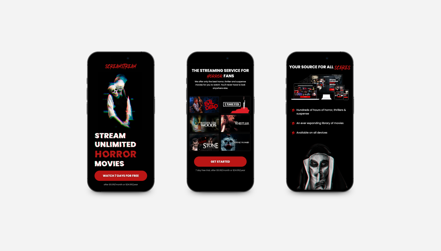
UX Strategy & Wireframes
Information Architecture :
- Hero Section: Tagline, eerie imagery, CTA to “Start Watching”
- What’s Inside: Curated collections, exclusives, categories (slasher, thriller, paranormal)
- Platform Features: Watch anywhere, cancel anytime, no ads
- Teaser video section (optional autoplay mute)
- Trust markers: “Trusted by horror fans worldwide”, social proof, ratings
- CTA repeated in sticky nav or section footer
- Footer: Terms, privacy, contact
Wireframe Focus :
- Clear emotional flow: tension > curiosity > action
- Strong visual rhythm: alternating dark/light contrast sections
- CTA clarity despite dramatic theme
UI Design Approach
Visual Style :
- Dark UI with blood red accents and grain textures
- Film-inspired typography with high contrast (Gothic serif + modern sans)
- Cinematic imagery, manipulated to enhance tension with overlays, blurs, glitch
Accessibility Considerations :
- Contrast compliance despite dark theme
- Alt text and clear labels for CTAs
Design Review & Developer Handoff
I managed this project from start to finish, handling both the design and development of the landing page, from initial exploration and wireframing to the final implementation.
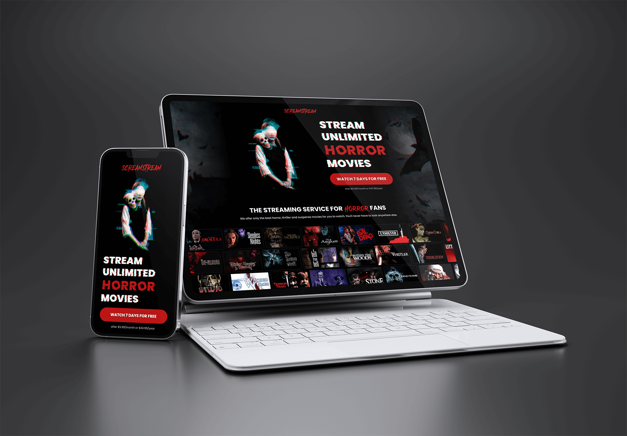
Final Design Overview
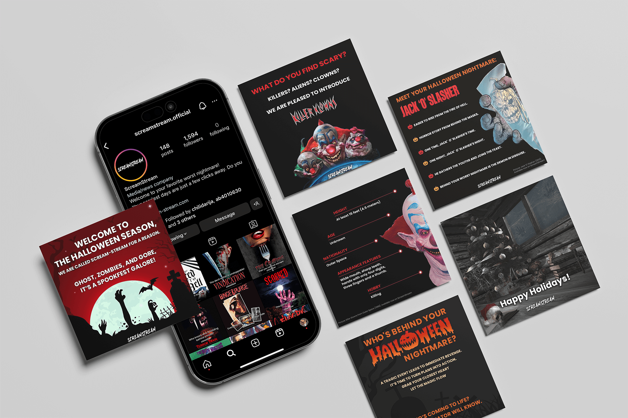
The final design positions ScreamStream as a bold, unapologetically dark streaming brand for horror fans. A black-and-blood-red palette, glitch-effect imagery, and gritty display typography carry across every touchpoint: a conversion-focused landing page with clear free-trial CTAs designed for desktop and mobile, a full set of display ads sized for standard banner placements, a series of Halloween-themed Instagram posts mixing character spotlights with seasonal greetings, and a welcome email that brings the same eerie tone straight into the user's inbox. Every piece reinforces one cohesive identity that is cinematic, playful, and just unsettling enough to make horror lovers click "Start Watching."


Outcomes & Reflections
- It helped demonstrate my ability to blend emotion-driven design with clean UX
- Showcased my strength in design-to-development handoff or direct build
- Clients and peers praised the atmosphere and cohesion across platforms
What I learned : Designing for emotion isn’t about loud visuals, it’s about creating a mood that leads to trust and action.