Timume
Overview
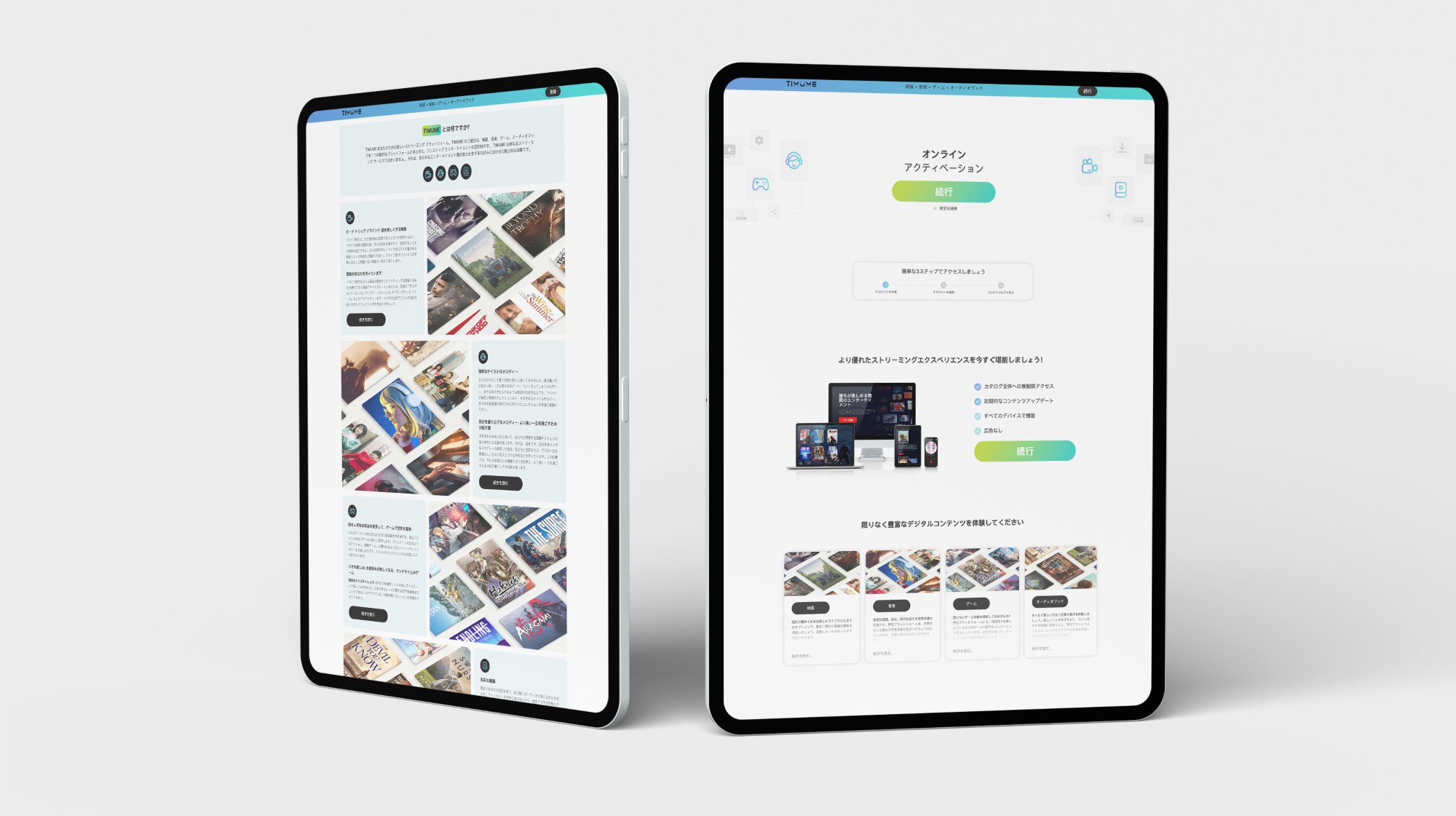
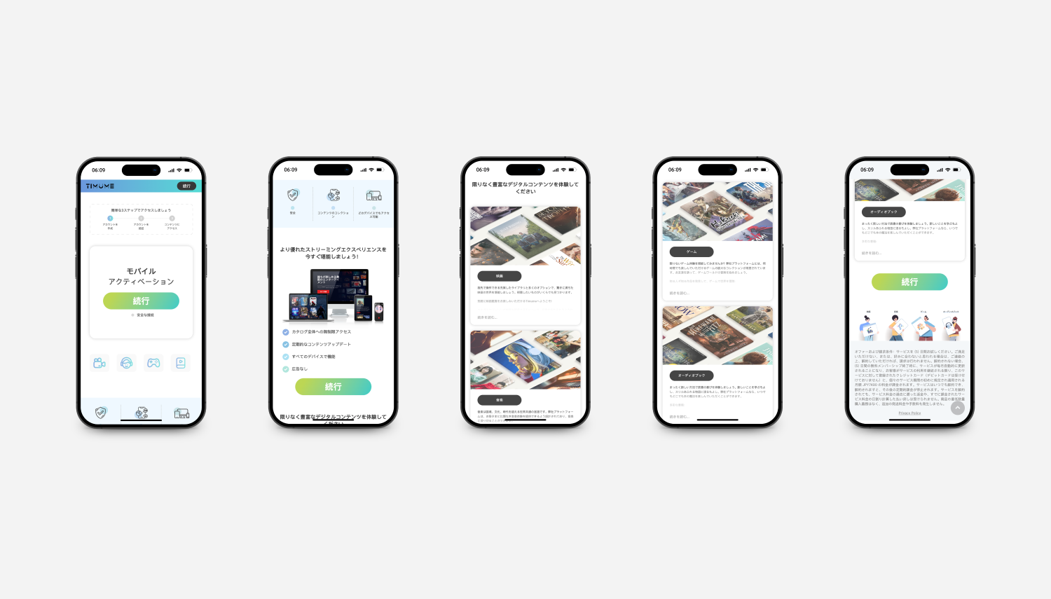
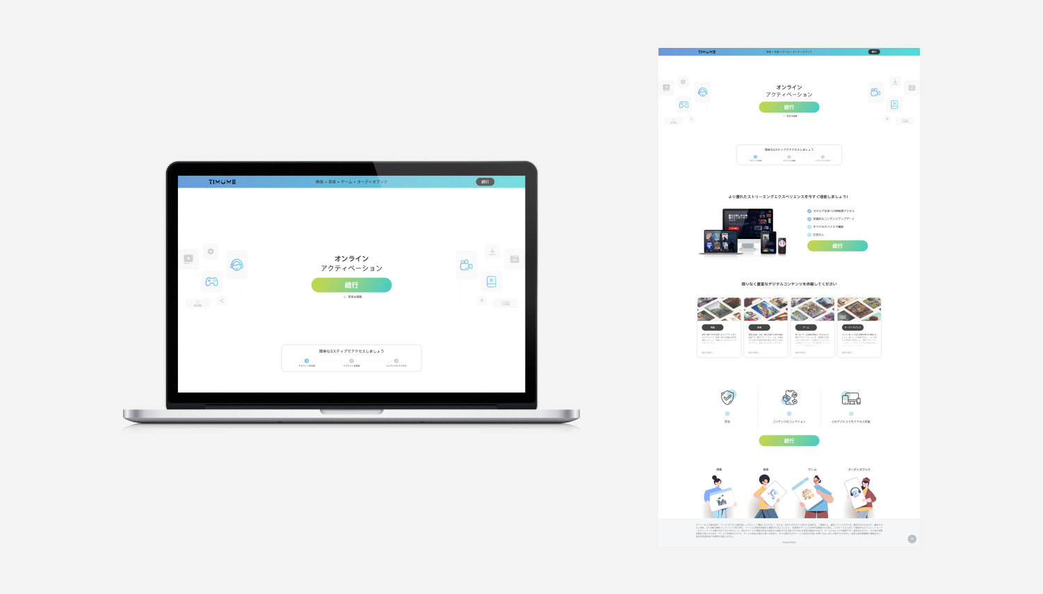
Timume is a multi-content campaign that aims to run in Japan to promote a streaming platform offering movies, games, audiobooks, and music that fully aligned with Google’s UX and content policies.. This landing page is designed specifically for the country where everything can be "kawaii". Here I show the desktop together with mobile design for a landing page. There is also an article page design for this campaign.
Project :
Timume
Role :
Designer / Web Developer
Project Type :
Landing Page Design for Streaming Service
Platform :
Web (mobile-first responsive design)
Focus :
Conversion optimisation, clarity, compliance (Google policy)
The Challenge
Timume needed a dedicated landing page to promote its digital streaming service, a platform offering movies, audiobooks, games, and music. The content had to cater to a Japanese-speaking audience, be mobile-first, and fully comply with Google’s UX and advertising policies.
The page needed to :
- Clearly communicate the platform’s value proposition
- Build trust and credibility with transparent content
- Convert users into trial sign-ups or subscribers
- Function well across all devices, especially mobile
- Meet strict content standards for SEO and paid ads
Objectives
- Design a visually compelling landing page that introduces the service effectively
- Establish a clear content hierarchy to avoid cognitive overload
- Drive conversions via strategically placed CTA buttons (e.g., “Start Free Trial”)
- Ensure full alignment with Google’s advertising/content policies
- Build trust through transparency and user expectations (terms, features, disclaimers)
- Optimise performance for mobile users (lightweight layout, thumb-friendly flow)
I studied similar streaming platforms like:
- Netflix Japan
- U-NEXT
- Rakuten TV
- Amazon Prime Video (Japan)
Key takeaways:
- Minimal but bold hero sections
- Focus on features and content variety
- High-converting CTAs early and often
- Mobile-first design is non-negotiable
- Policy-aligned: full disclosure of terms, pricing, and cancelation
UX Strategy & Wireframes
Information Architecture Highlights:
- Hero Section – Logo, intro copy, and strong CTA (e.g., “Start Free Trial”)
- What’s Inside – Icons + descriptions of movies, audiobooks, games, and music
- Key Features – Benefits like “Unlimited Access”, “Multi-Device Use”, “Ad-Free”
- User Expectations – Pricing transparency, policy disclaimers, cancellation terms
- FAQs / Support Info
- Footer – Legal links, social media, support
I wireframed the layout in mobile-first format, followed by desktop scaling.
UI Design Approach
I created a clean and engaging interface that visually supports the product’s appeal.
Key Visual Decisions:
- Hero Banner: Soft gradient background, large headline, subtext, and call-to-action
- Feature Icons: Simple visual cues for each content category (movies, games, audiobooks, music)
- CTA Buttons: Persistent on mobile, always clear and action-oriented
- Typography: Balanced Japanese fonts for readability and local tone
- Visual Trust Elements: Badge-style icons for “Secure Payment”, “Policy-Compliant”, and “Google Ads Ready”
- Mobile First: Vertical stacking, large tap areas, collapsible FAQs
All content followed Google's ad policy rules, that means no exaggerated claims, no misleading graphics, and clear links to policies.
Design Review & Developer Handoff
I led this project end to end, handling both the design and development of the landing page.
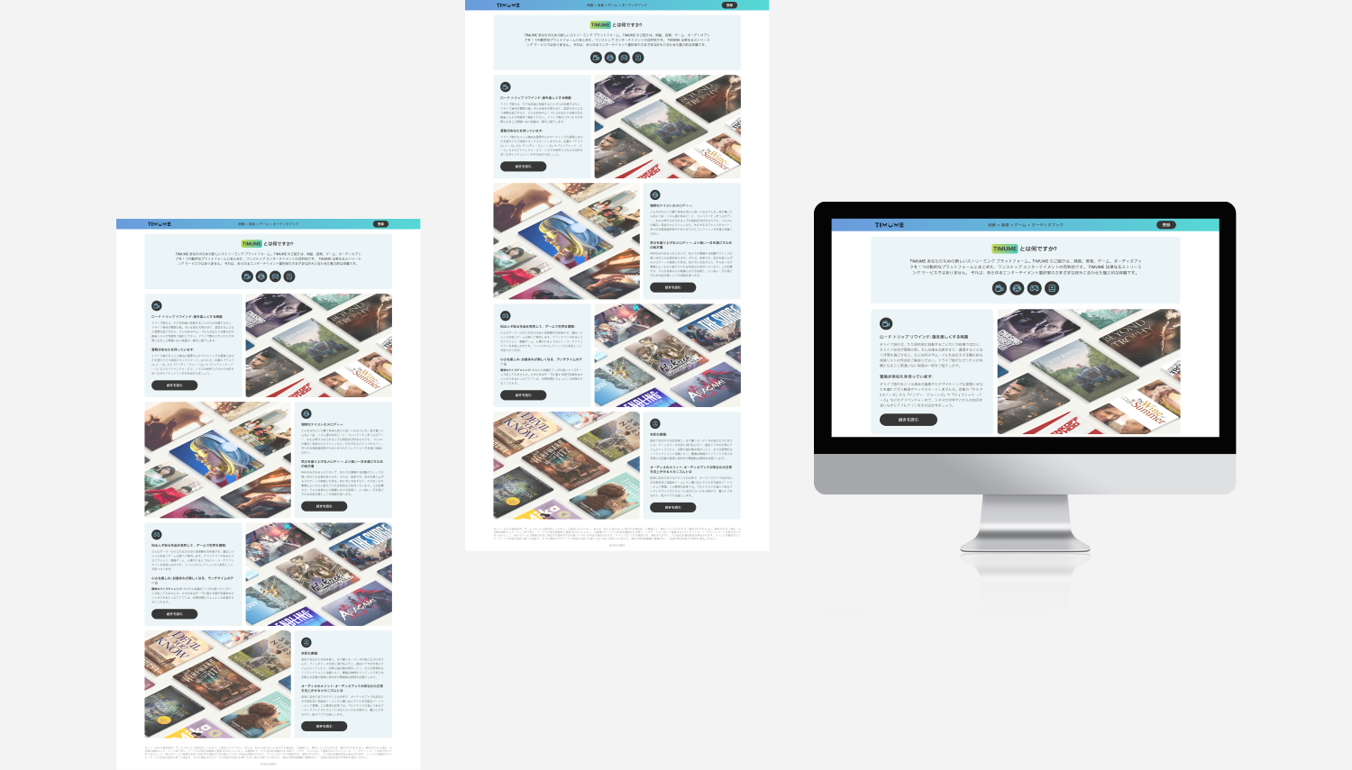
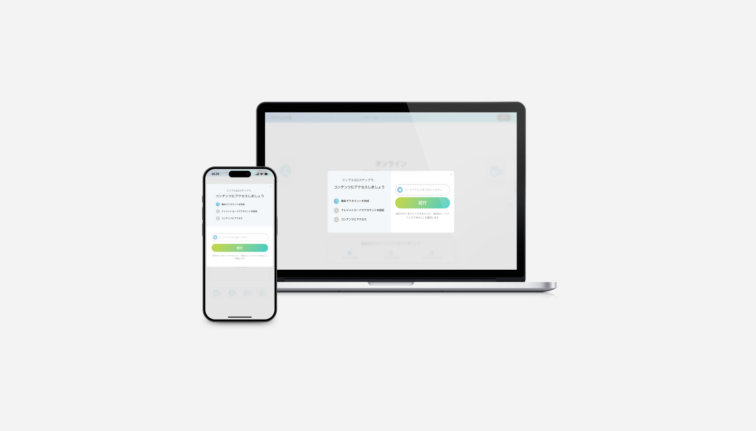
Final Design Overview
TIMUME's landing page is engineered as a single-goal conversion funnel for a Japanese streaming bundle covering movies, music, games, and audiobooks. Hierarchy descends from a high-contrast lime CTA to value reinforcement to a 3-step progress tracker that lowers perceived effort, with the same gradient button repeating at every decision point and supporting content sitting in low-contrast rounded cards. Component anatomy stays constant from a 12-column desktop grid down to a single-column mobile stack, so users recognise the same primitives across breakpoints. A two-tone color system separates identity from intent: blue-to-cyan for brand, saturated green for action.
Outcomes & Reflections
What I learned : Designing this landing page taught me how to balance creative freedom with strict policy guidelines. It strengthened my skills in simplifying complex offerings into digestible, user-friendly formats, all while keeping conversions top of mind.