Travel Apps
Overview
A UX/UI design project focused on creating a web platform that helps users discover and explore a curated selection of travel-related tools and apps. The objective was to ensure a clear, intuitive, and visually cohesive experience that supports travelers in finding the right resources for every stage of their journey.
Project :
Travel-Apps.com
Role :
UX/UI Designer (from concept to developer handoff)
Project Type :
Travel App Collection Website
Platform :
Web (responsive design)
Focus :
App discovery, intuitive layout, clean handoff, and scalable design system
The Challenge
The brief was to design a travel app collection platform that helps users discover, browse, and access various apps that cater to different aspects of travel, from navigation to booking, translation, budgeting, and more.
Challenges included :
- Making the interface easy to scan despite high content density
- Creating a clean, engaging layout for app discovery and categorisation
- Designing a scalable system that would support continuous content expansion
- Ensuring smooth communication with developers for pixel-perfect implementation
Objectives
- Design an engaging, user-friendly platform for app discovery
- Ensure the visual hierarchy is strong across categories and app cards
- Apply consistent UI principles for trust and clarity
- Build a responsive layout optimised for mobile and tablet users
- Conduct a professional handoff to developers with documentation and feedback loops
I conducted competitive and comparative research by reviewing similar app marketplaces and resource platforms (e.g. Product Hunt, App Store, curated tech stacks).
Key takeaways :
- Users scan first, then decide. Clear categories and app icons are essential.
- Credibility signals like ratings or categories increase trust.
- Pages must load fast and feel clean.
UX Strategy & Wireframes
Information Architecture
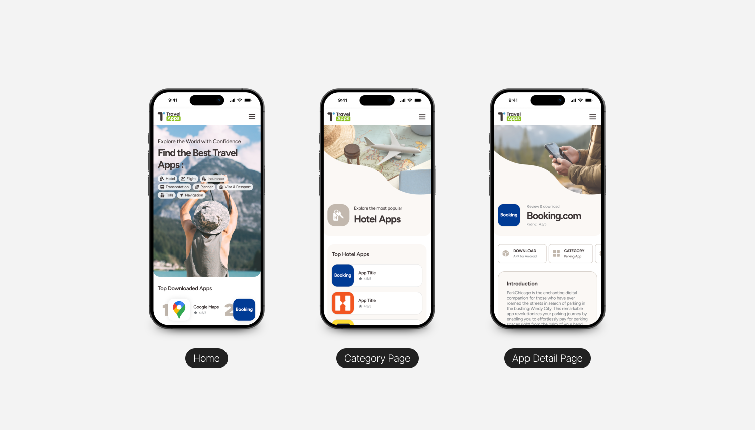
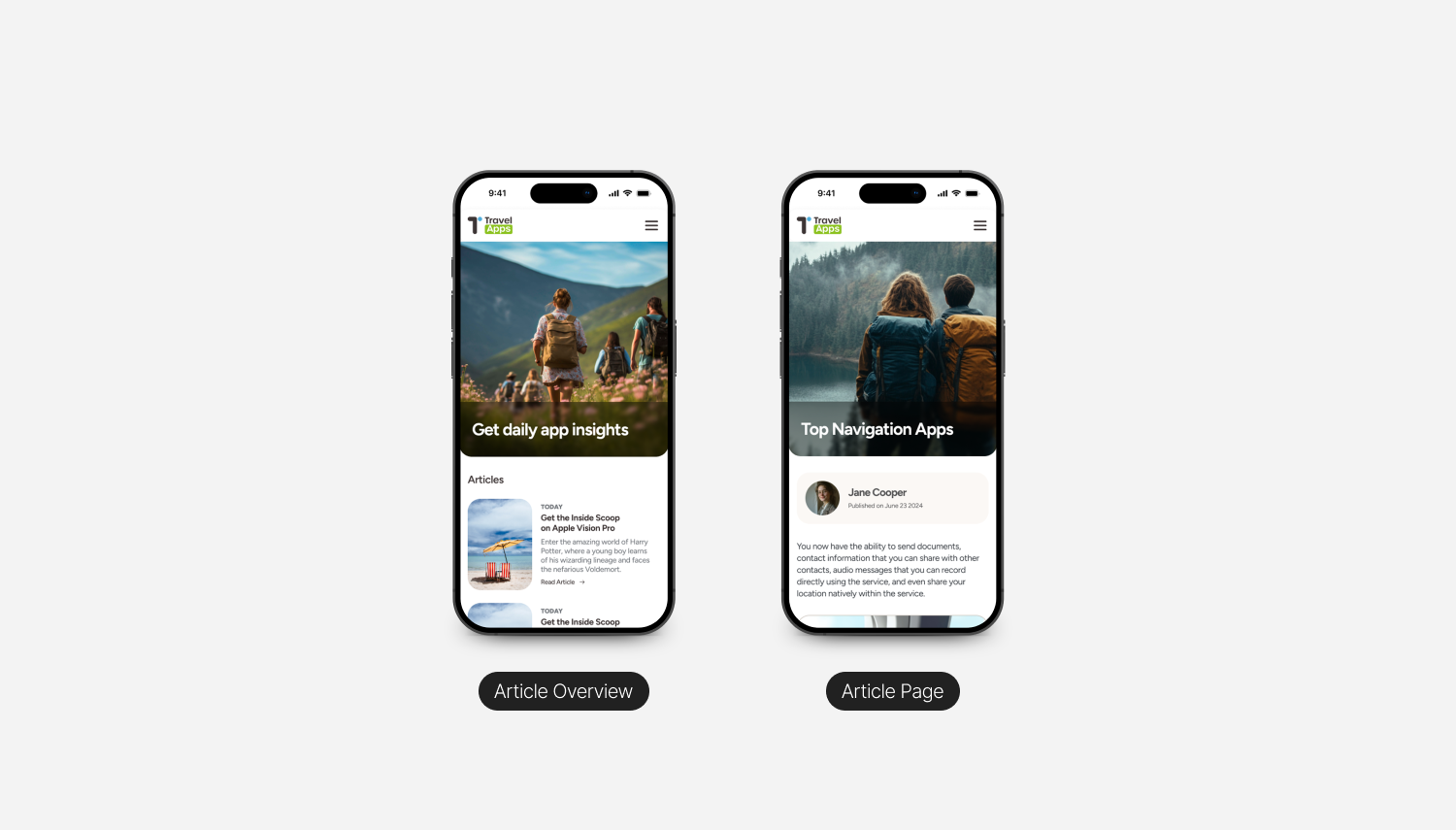
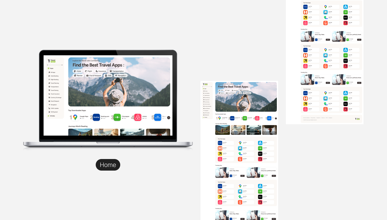
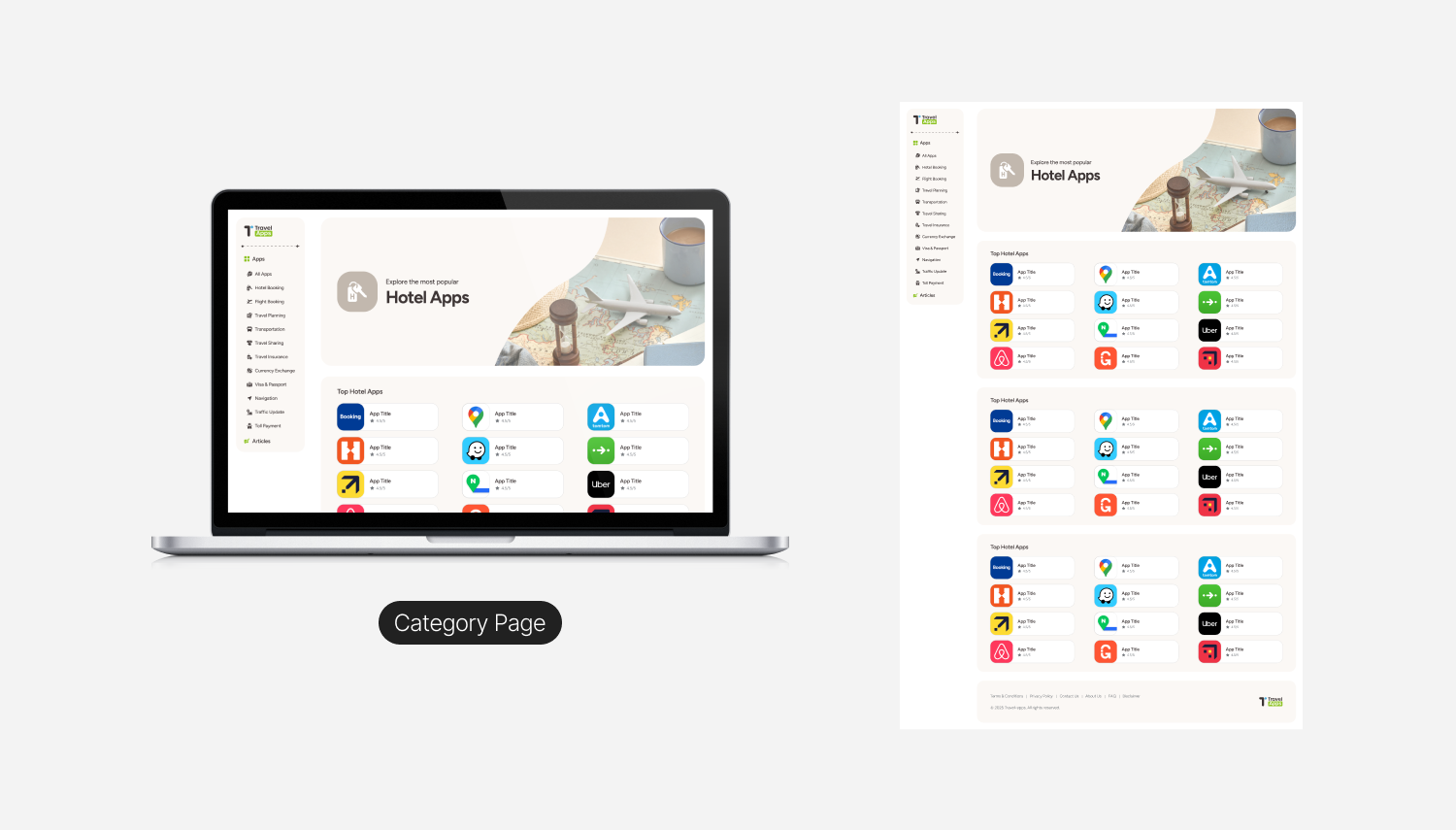
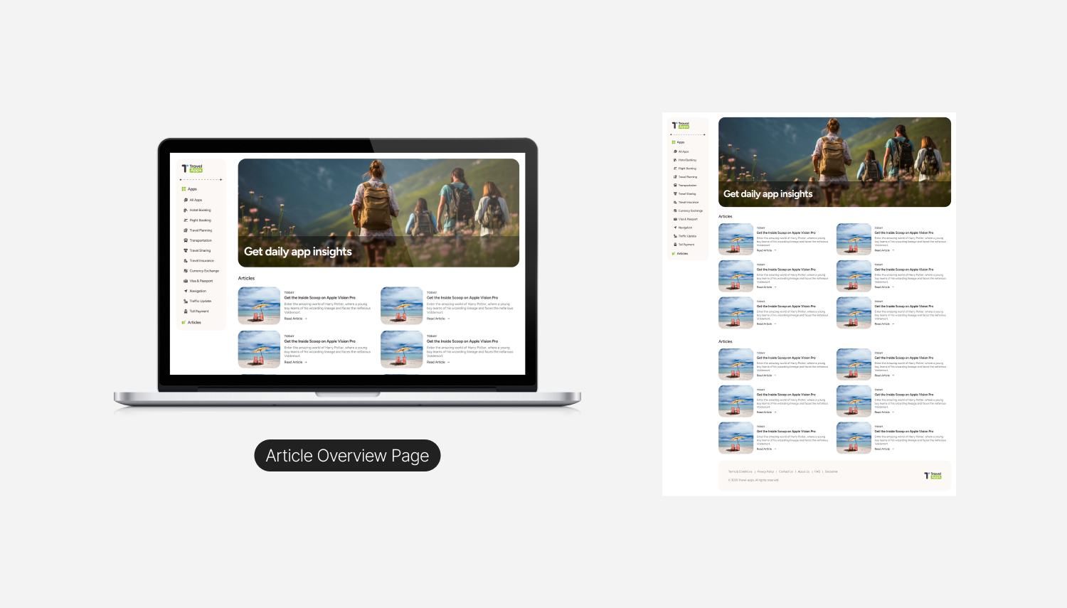
- Homepage: App categories (e.g., Maps, Language, Booking)
- Category Pages: App cards with icons, titles, descriptions, and external links
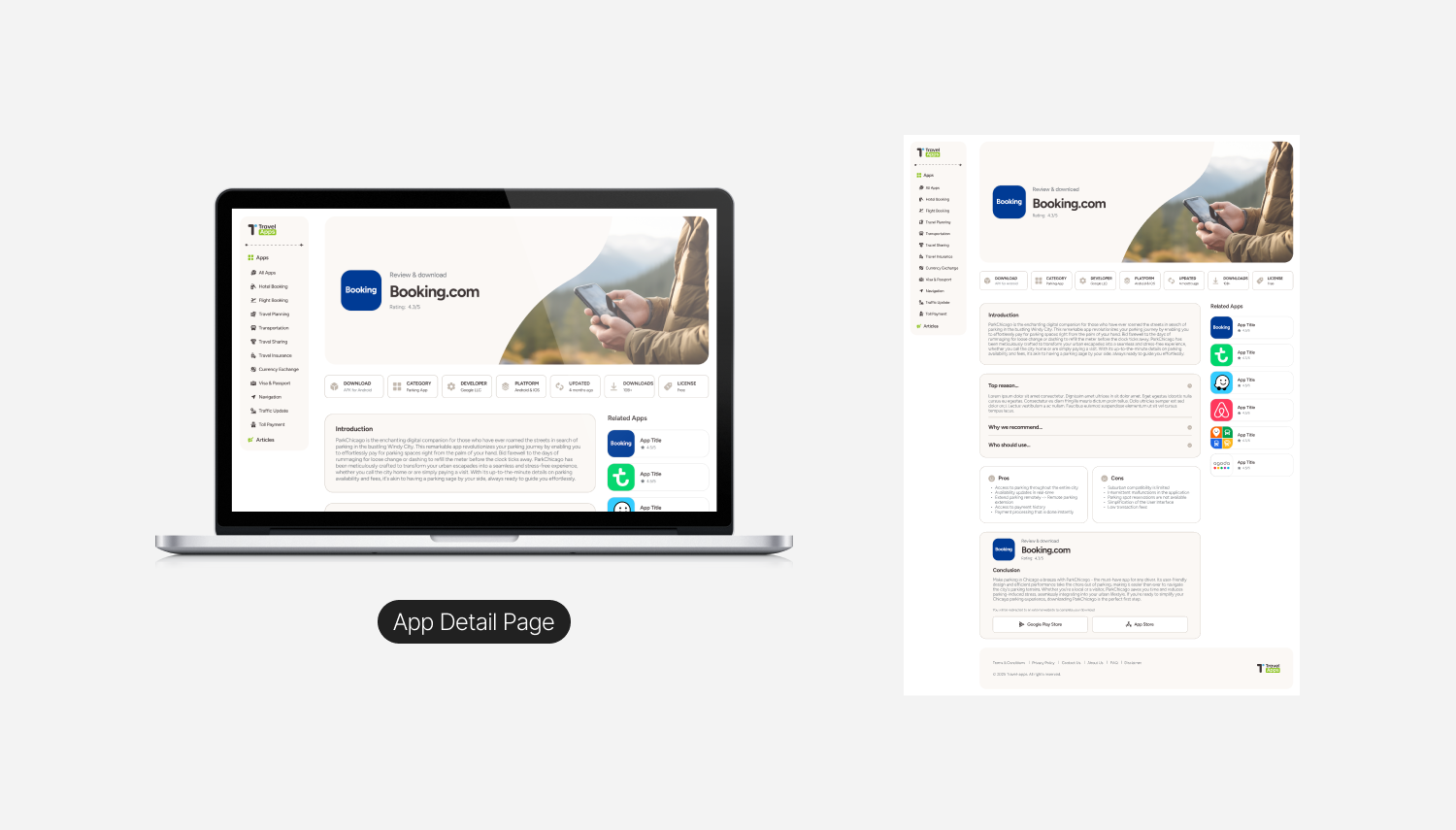
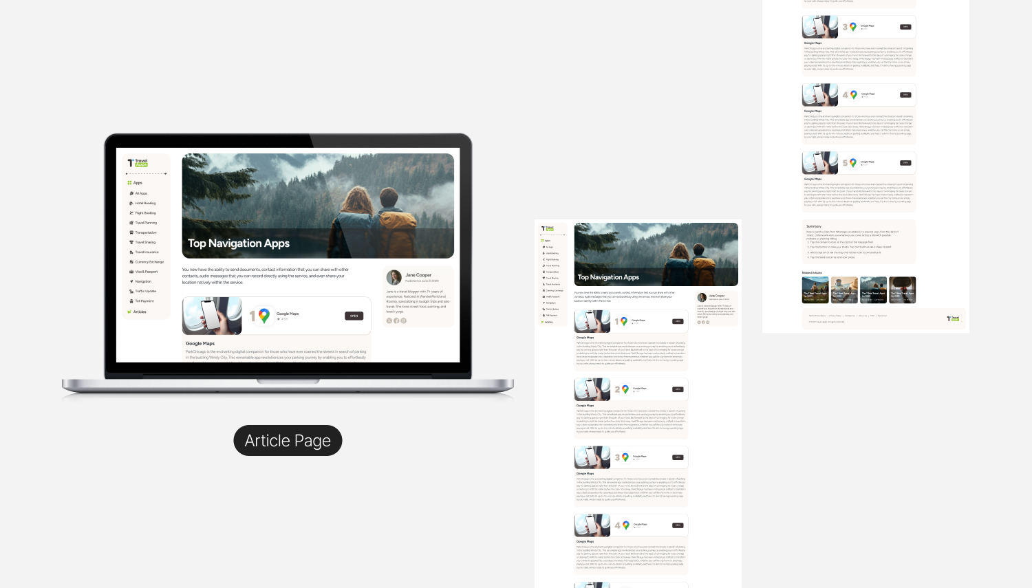
- Detail Page (Optional): Short app summary + CTA
- Global Elements: Sticky navigation, search/filter, footer with terms and privacy
Wireframes
- Define user journeys (browsing > app card > click-out)
- Optimise for clarity, contrast, and grid structure
- Validate key flows before diving into visual design
UI Design Approach
Visual Design Principles :
- Minimalist, editorial feel to balance utility with inspiration
- Travel-themed accent colours (soft blues, greens, sandy beige)
- Clear iconography and app visuals with strong contrast
- Legible typography across screen sizes
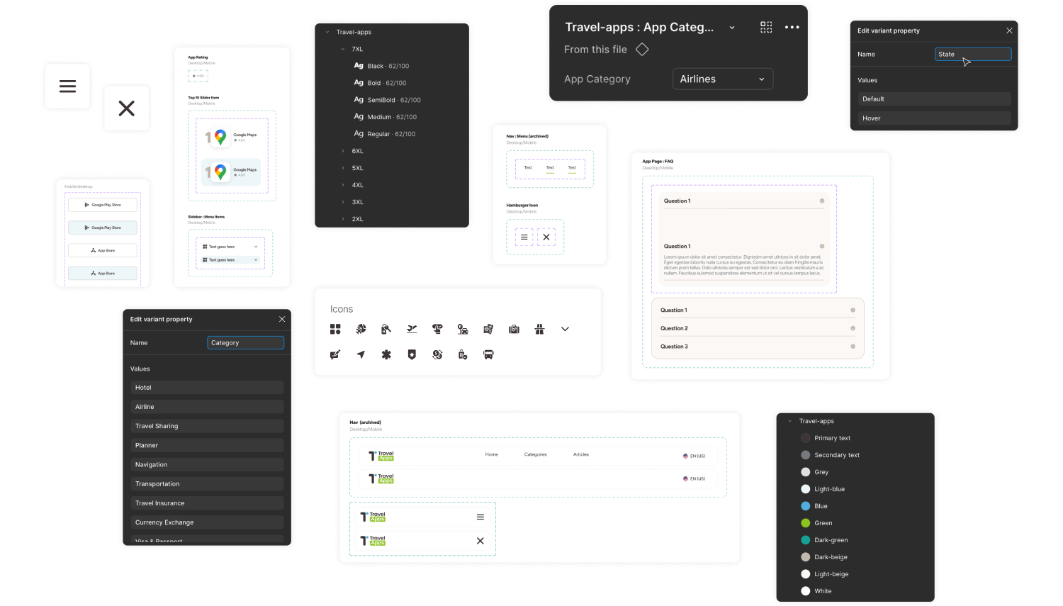
Component System :
- App Card Component with image/icon, name, short description, CTA
- Category Header with subtle illustrations
- Navigation System that’s flexible and easy to expand
Design Review & Developer Handoff
This project was taken through structured design handoff :
- Figma files organised by components, screens, and states
- Conducted design review sessions with the development team and project manager to ensure alignment
- Addressed technical constraints and feedback in real-time
- Provided a mini style guide: typography, colours, spacing, and interaction notes
- Maintained open communication via Microsoft Teams during development
This was a great example of how clear documentation and collaboration can ensure design quality is preserved through development.
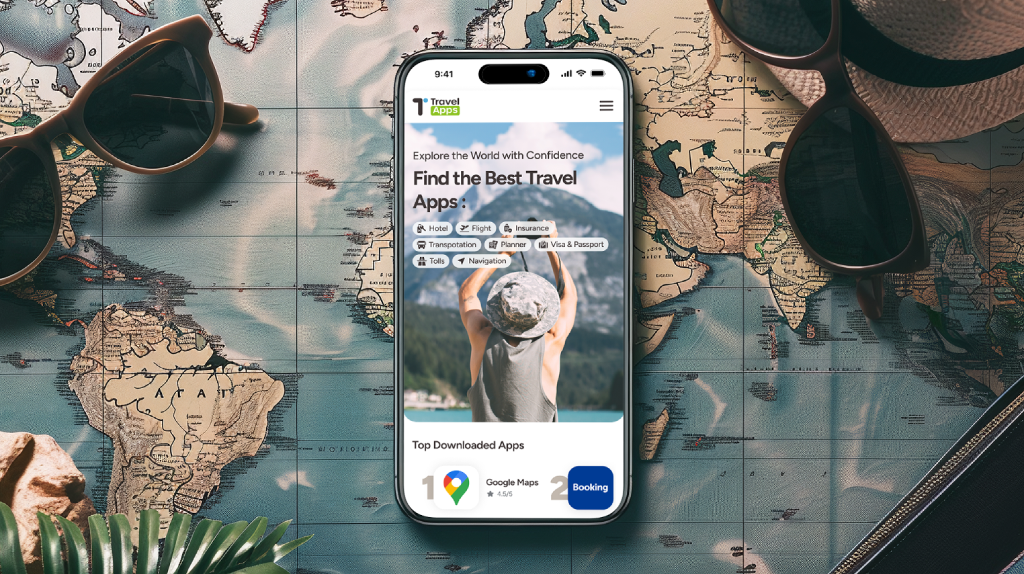
Final Design Overview
The final design brings Travel Apps to life as a calm, content-first discovery platform for travel tools. A persistent sidebar anchors navigation across Home, Category, App Detail, and Article pages, while soft cream backgrounds, bold typography, and authentic travel photography give the experience an editorial feel. Users can explore curated rankings, dive into detailed app reviews complete with metadata, pros and cons, and direct store links, or settle into long-form articles that blend storytelling with inline product discovery. The system scales seamlessly from desktop to mobile, collapsing into a thumb-friendly layout without losing its clean hierarchy or visual warmth.
Outcomes & Reflections
While analytics post-launch were handled by the development team, I received positive feedback on :
- The ease of implementation thanks to the clean Figma structure
- Low friction collaboration between design and dev
- The interface's clarity and consistency
What I learned : Designing platforms that scale is not just about UI, it’s about planning, system thinking, and communication with your team.