Argo Rentals
Overview
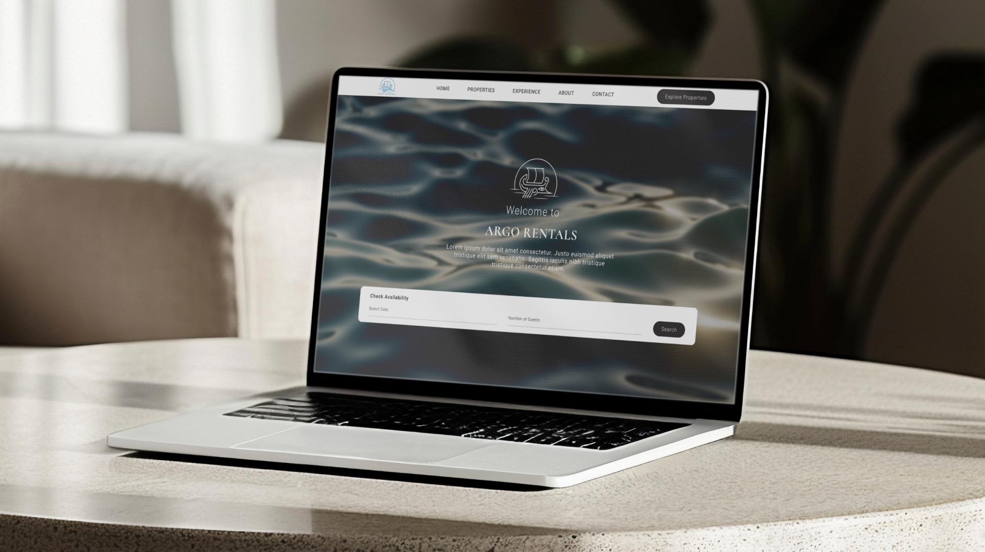
End-to-end UX/UI, web design, and brand application for Argo Rentals, a family-owned holiday home business based in Xanthi, Greece. From early research and wireframes through visual design, the live website build, and the print and social materials that surround it, the goal was to give a small, hands-on family business a digital presence that finally matches the way they actually host.
Project :
Argo Rentals
Role :
Sole UX/UI Designer & Web Designer
Project Type :
End-to-End Web Design
Platform :
WordPress + Elementor
Focus :
Direct Bookings & Brand Trust
The Challenge
Argo Rentals had what most rental hosts dream of. Strong reviews, genuine repeat guests, and a hospitality style that came from running the business as a family. But online, none of that was visible. Their listings sat on Airbnb and Booking.com, undifferentiated from thousands of others, paying double digit commissions on every booking.
The bigger problem was structural. On those platforms, every guest interaction starts and ends inside someone else's product. Travelers see a generic listing, talk to a generic inbox, and walk away with no real memory of who actually hosted them. For a family business whose biggest advantage is being human, that visibility gap was the entire problem.
The starting point
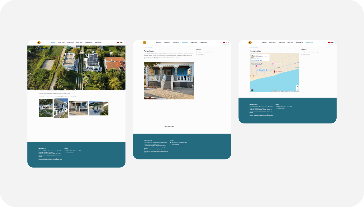
Argo Rentals already had a website when the project began, but it was actively working against the business rather than helping it. The brand identity was inconsistent, with the header reading "Argo Apartments" and the footer reading "Avdira Rentals." The homepage opened with an aerial photo and a single line of generic copy, with no clear value proposition, no inquiry path, and no booking widget. Properties were listed by family member names with no visual hierarchy or context, and each property page relied on tiny thumbnail galleries that actively undersold the homes. The "Communication" page was a Google Map and an address. Nowhere on the site was there a single mention of the family that runs the business, which is the brand's biggest competitive advantage.
The decision to rebuild from scratch was straightforward. The existing site could not be improved in place. It needed a different foundation, a clear identity, and a structure built around how travelers actually decide where to stay.
The design challenge that emerged from all of this was to translate the personality of a real family, and the character of a specific place most travelers have never heard of, into a digital experience that could hold its own next to billion dollar platforms.
Objectives
Before any design work began, I worked with the family to define what success would actually look like. The objectives were intentionally focused, with a bias toward outcomes the business could feel rather than vanity metrics.
Business objectives:
- Build a credible direct booking channel that does not depend on third party platforms.
- Reduce the share of bookings flowing through Airbnb and Booking.com over the next full season.
- Create a foundation that can grow with the business, including new properties and a real time booking layer in the future.
User objectives:
- Make it possible for a first time visitor to understand who Argo Rentals is, and trust them, in under thirty seconds.
- Show every property honestly, with real photography, transparent pricing, and complete details, so guests never have to email to find out the basics.
- Make inquiry effortless on mobile, where most travel research and booking actually happens.
Brand objectives:
- Express the warmth and personality of a family run business without slipping into cliché.
- Build a visual identity strong enough to extend across the full guest experience, from the website to the printed welcome book inside the property.
Understanding how travelers actually choose where to stay.
Before opening Figma, I spent around 2 weeks mapping the landscape. I audited more than 10 competitor experiences, including a mix of global platforms (Airbnb, Booking.com, etc.) and independent Greek villa and holiday home sites. I pulled apart how each one handled the four moments that matter most: arrival, search, trust, and inquiry.
A few patterns stood out:
- Platforms win on inventory but lose on intimacy. Listings feel interchangeable. There is a real opening for a brand that feels human, specific, and local.
- Independent rental sites bury the basics. Many made it hard to see what was actually on offer, including date availability, pricing, and what was included, without filling out a form first.
- Photography is the entire product. On every site I studied, weak photos killed otherwise great properties. Strong, honest, well shot photography correlated more with bookings than any other variable.
- Trust is built in seconds. Real names, real faces, real reviews, real location detail. The absence of any of these reads as a red flag to a traveler weighing a small operator they have never heard of.
I also looked at the wider context of the region. Xanthi sits in Thrace, in northern Greece, very close to the Bulgarian border. Most international travelers overlook this part of the country in favour of the islands or the Peloponnese, which is a constraint but also a positioning gift. The real visitor base here is regional, not international. Greek families taking a coastal break inside their own country, and Bulgarian families driving down across the border for a few days on the Aegean. That single insight changed everything about how the site needed to feel. Less aspirational lifestyle imagery aimed at first time visitors to Greece, and more practical, honest, family ready signals such as real kitchens, real beds, parking, distance to the beach, and a clear sense of who is hosting.
The same audience finding shaped the language layer. The site was designed and localized in three languages (Greek, English, and Bulgarian), so that the two largest visitor groups would land on a site that already spoke to them, with English available as a practical fallback for everyone else.
I synthesized the research into a working persona, built from desk research, review mining of platform listings in the area, and direct conversations with the family about who actually stays with them.
The Family Traveler. Most often a Greek or Bulgarian family in the 35 to 55 age range, traveling with children, parents, or extended family for a 3 to 7 day stay on the Aegean coast. They typically arrive by car, plan with practical constraints in mind, and rely heavily on personal trust networks (word of mouth, Facebook recommendations, repeat visits) long before they ever reach a website. By the time they land on Argo Rentals, they are usually checking three things: that the property is real, that the photos are honest, and that there is a human on the other end.
I worked through their journey in two distinct mindsets, because the same family behaves very differently depending on where they are in the decision.
- Researching. Wide net browsing across booking platforms, Facebook groups, and recommendations from friends and family. Wants to understand what the property actually looks and feels like, what is nearby, whether it suits the size and shape of the group, and who is hosting. Bounces in seconds if anything feels off.
- Booking. Narrowed down to one or two options. Wants to confirm the basics quickly, see honest details, and reach a real person, often through WhatsApp or phone rather than a contact form.
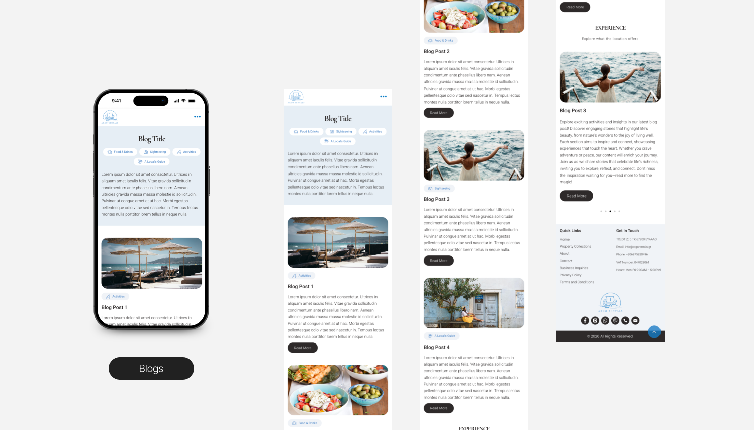
UX Strategy & Wireframes
The temptation with a hospitality business is to build out every conceivable page. I went the other way. The sitemap stays tight, with five primary destinations, so users always know where they are, and the path to a booking inquiry is never more than two clicks away.
Sitemap:
- Home
- Properties
- The Area
- About the family
- Contact / Inquiry
Key user flow, from discovery to booking or inquiry:
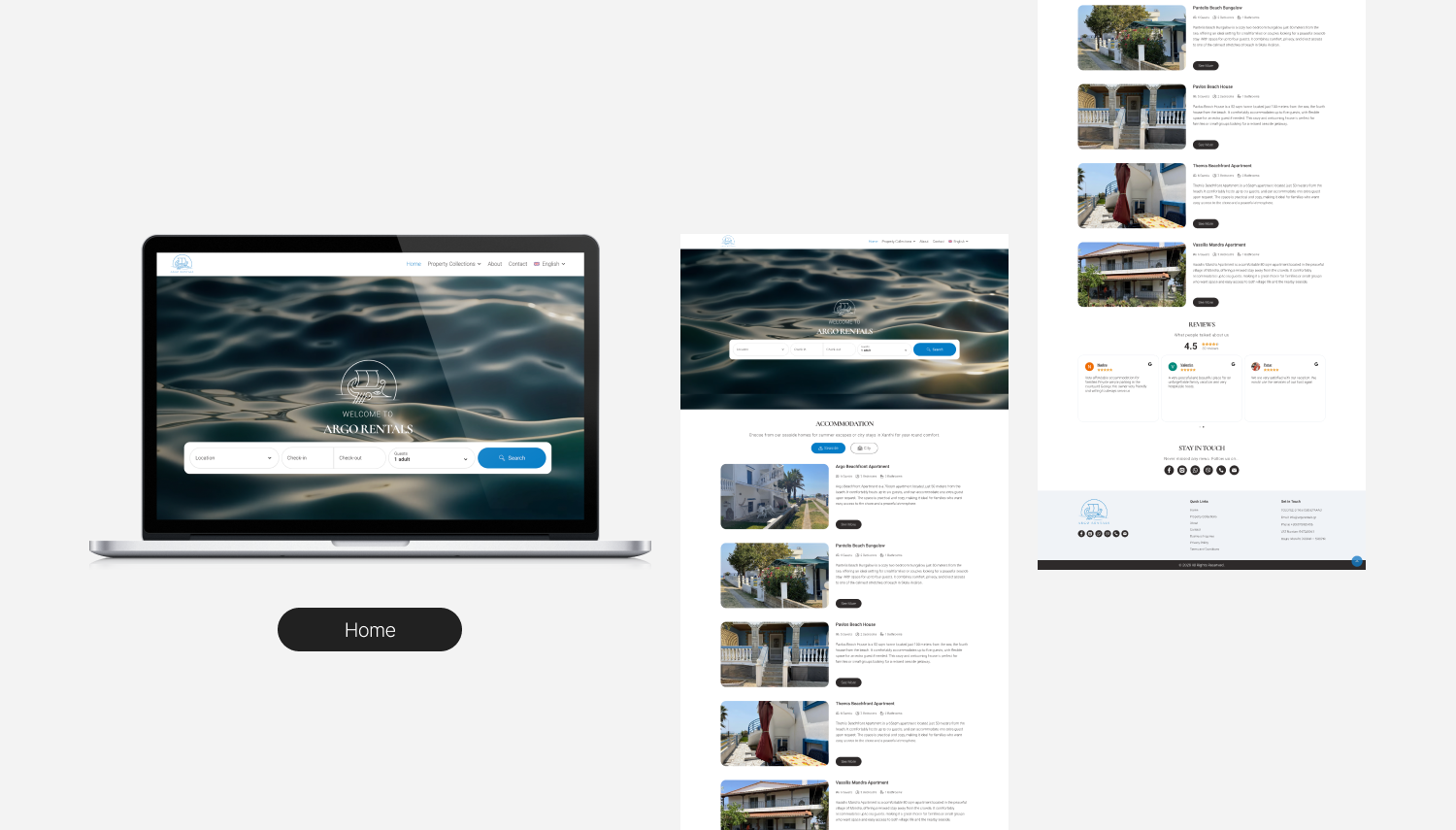
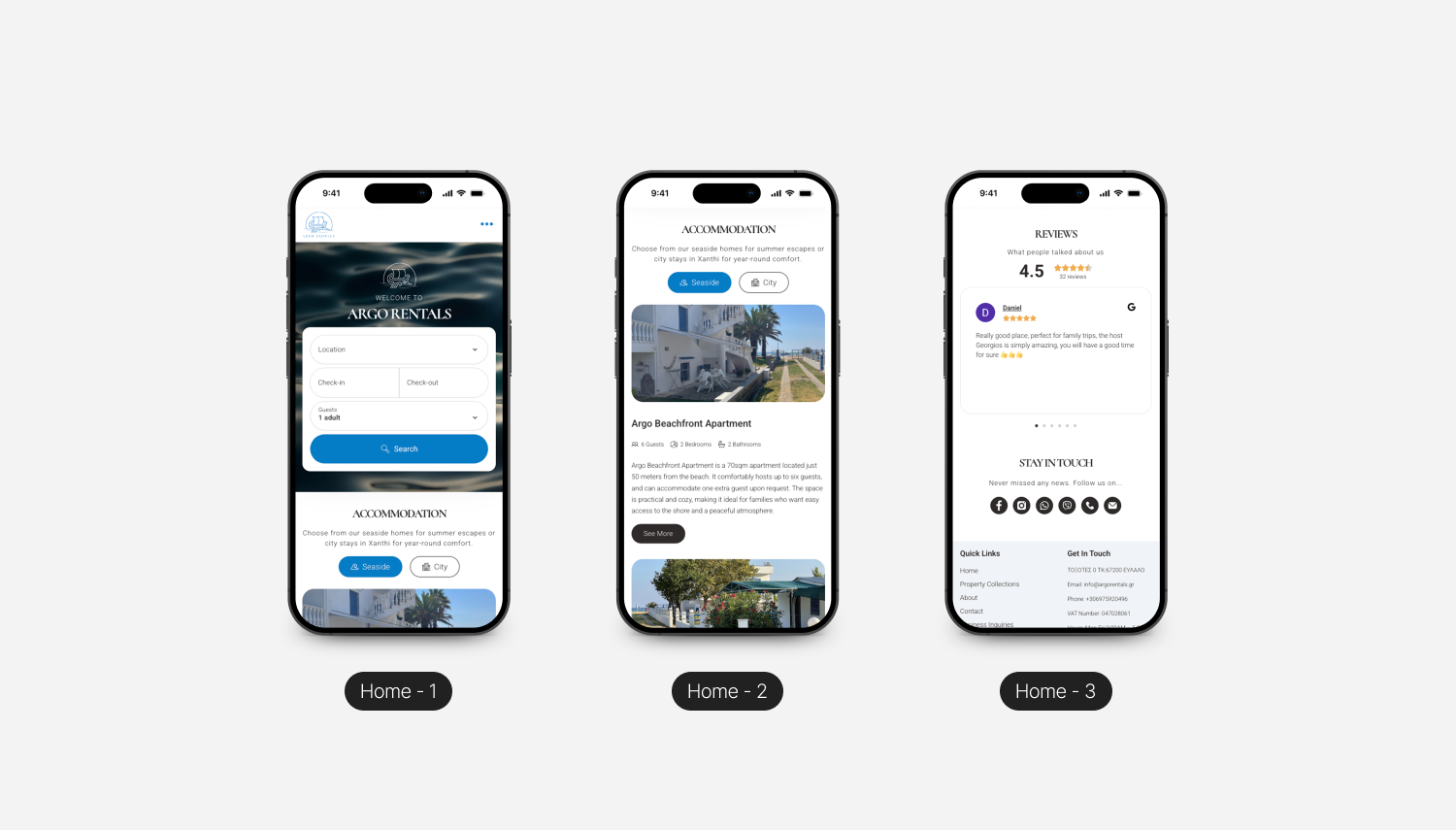
- Land on Home, with trust signals, story, and a clear path to properties.
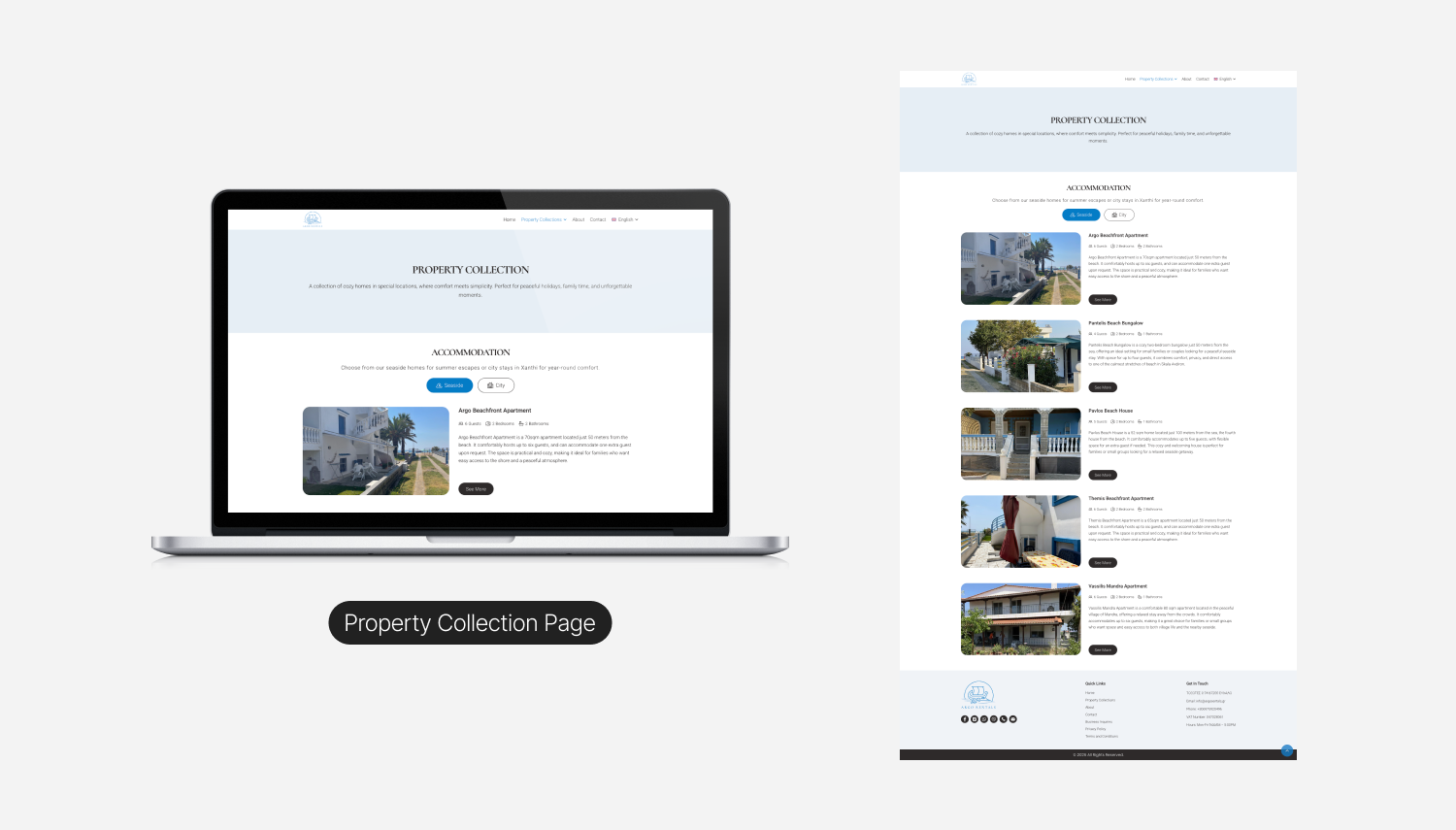
- Browse Properties, with real photography, transparent details, and clear nightly rates.
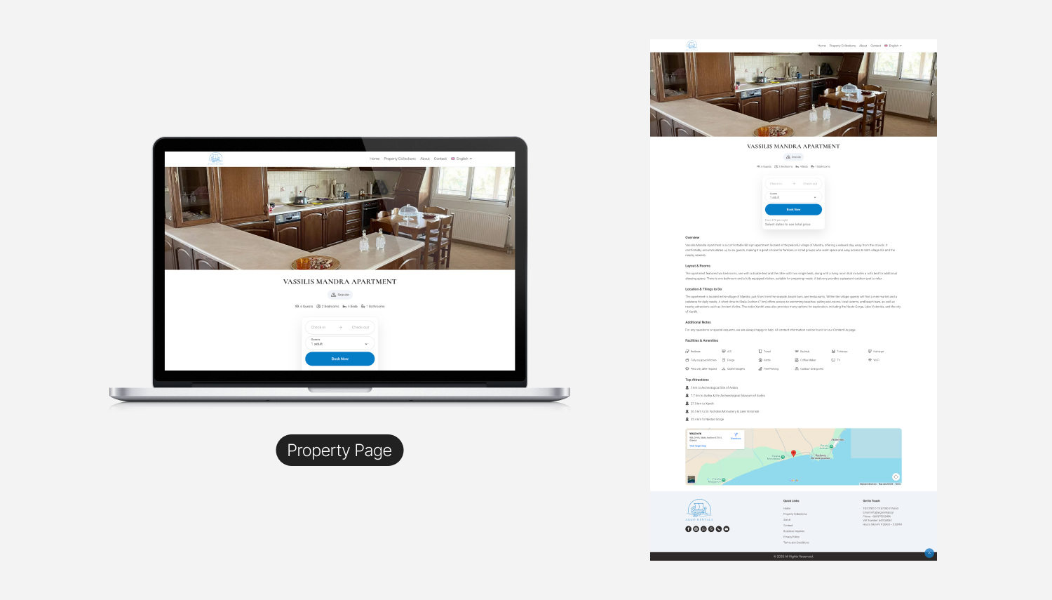
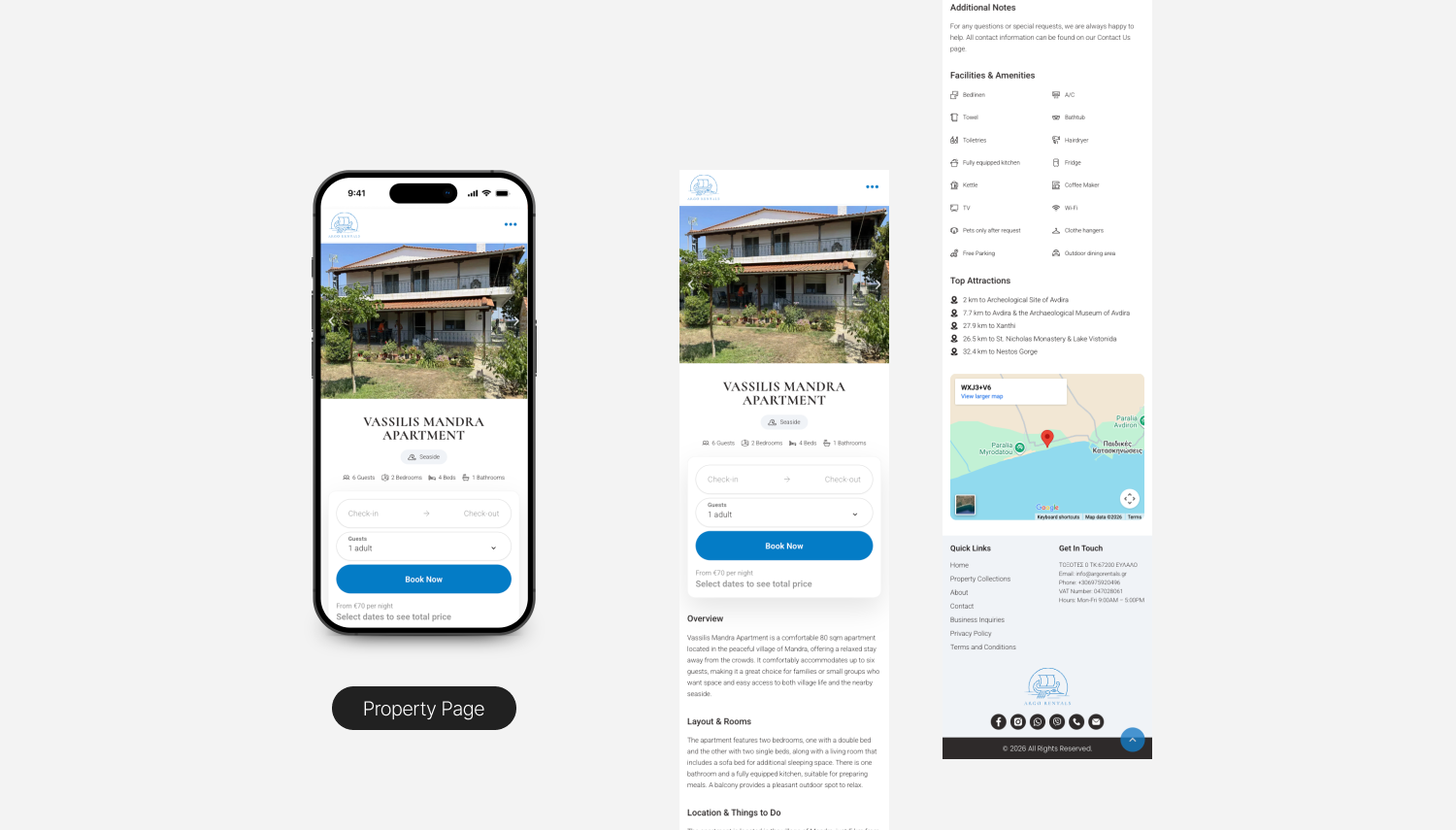
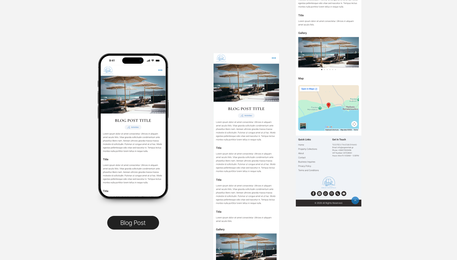
- Open a Property detail page, with full gallery, what is included, location, availability, and clear paths to either book or get in touch.
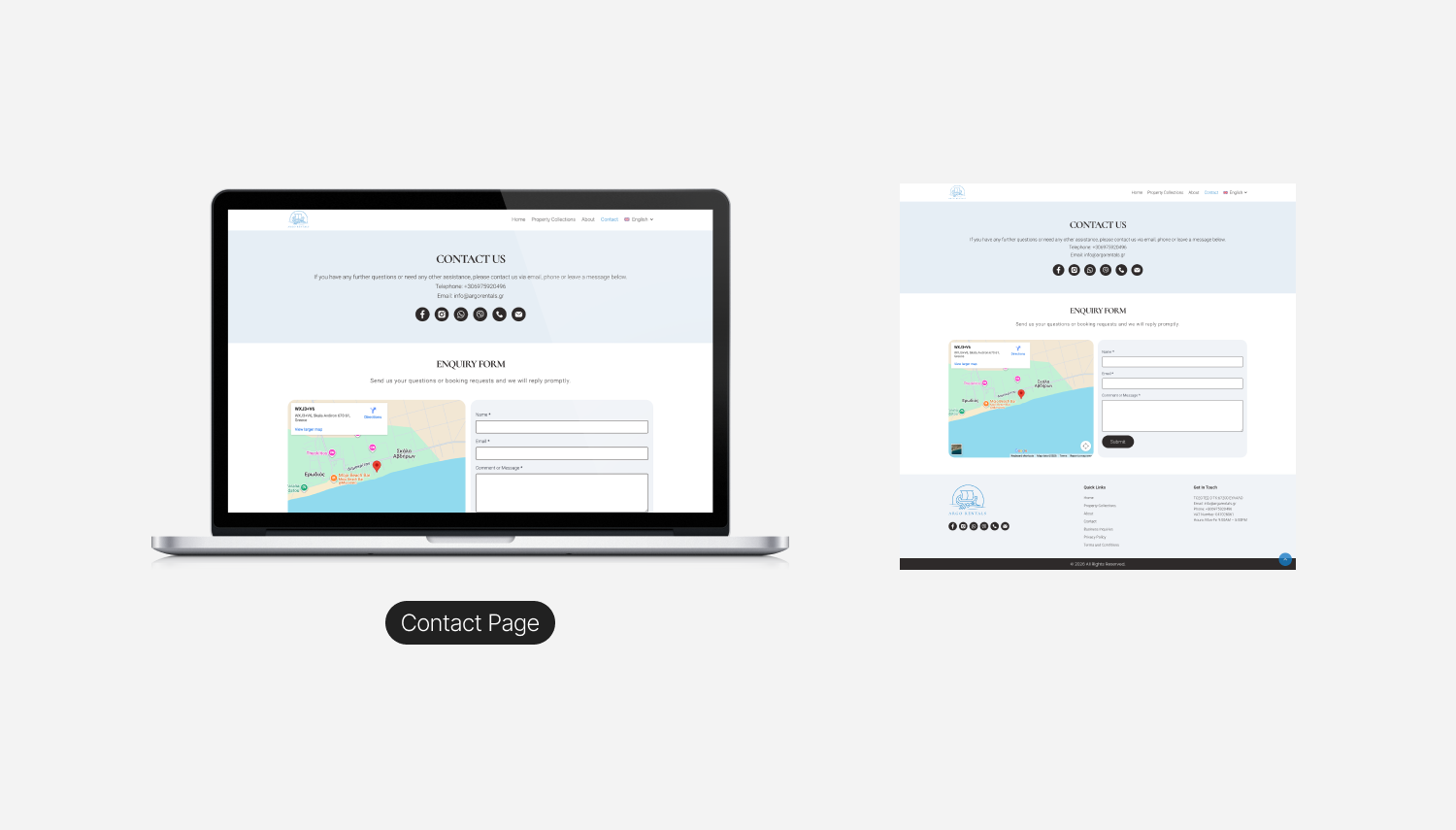
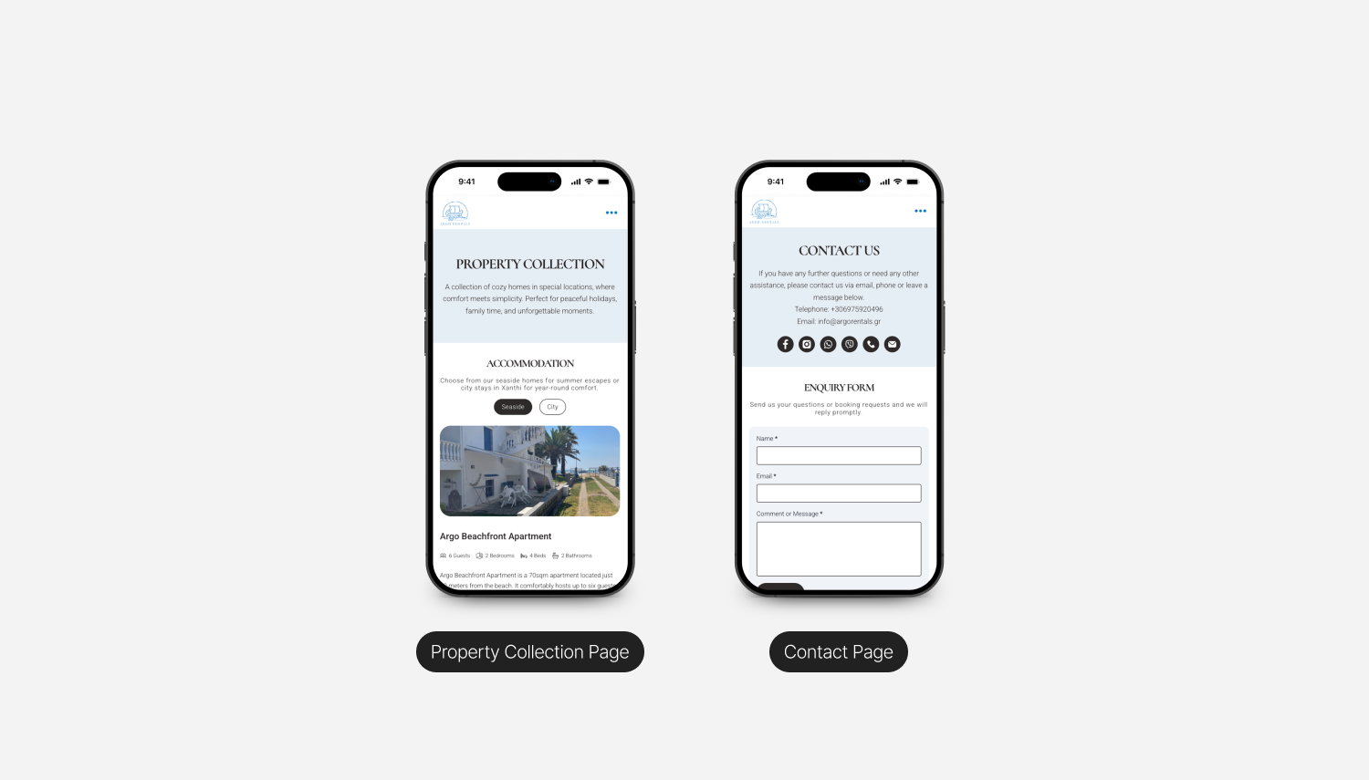
- Choose how to engage. Book directly through the widget for guests who want speed and certainty, or send an inquiry through the form, WhatsApp, or Viber for the majority who prefer a real conversation before committing.
- Receive a direct, personal reply from the family, not an automated funnel.
A deliberate decision to support both booking and inquiry paths.The client asked for a booking widget, which is the standard expectation in the category. The research said something different. Most of the actual guest base (Greek and Bulgarian families) prefers to message before they book, usually via WhatsApp or Viber, because they want to ask practical questions and feel out the host before committing. Forcing a single path would have failed one group. Building two clearly signposted paths, with the widget for confident bookers and a multi channel inquiry route (form, WhatsApp, Viber, phone) for everyone else, served both. The design treats them as equal options rather than burying one in favor of the other.
The flow also keeps a human in the loop on the inquiry side, because for a family run business, that personal follow up is the differentiator. It is the thing the platforms structurally cannot offer.
I started wireframing in low fidelity to argue with structure before getting attached to visuals. The first round was deliberately ugly, with grayscale boxes, placeholder text, and no imagery, so every conversation with the client was about hierarchy and content priority, not colour preferences.
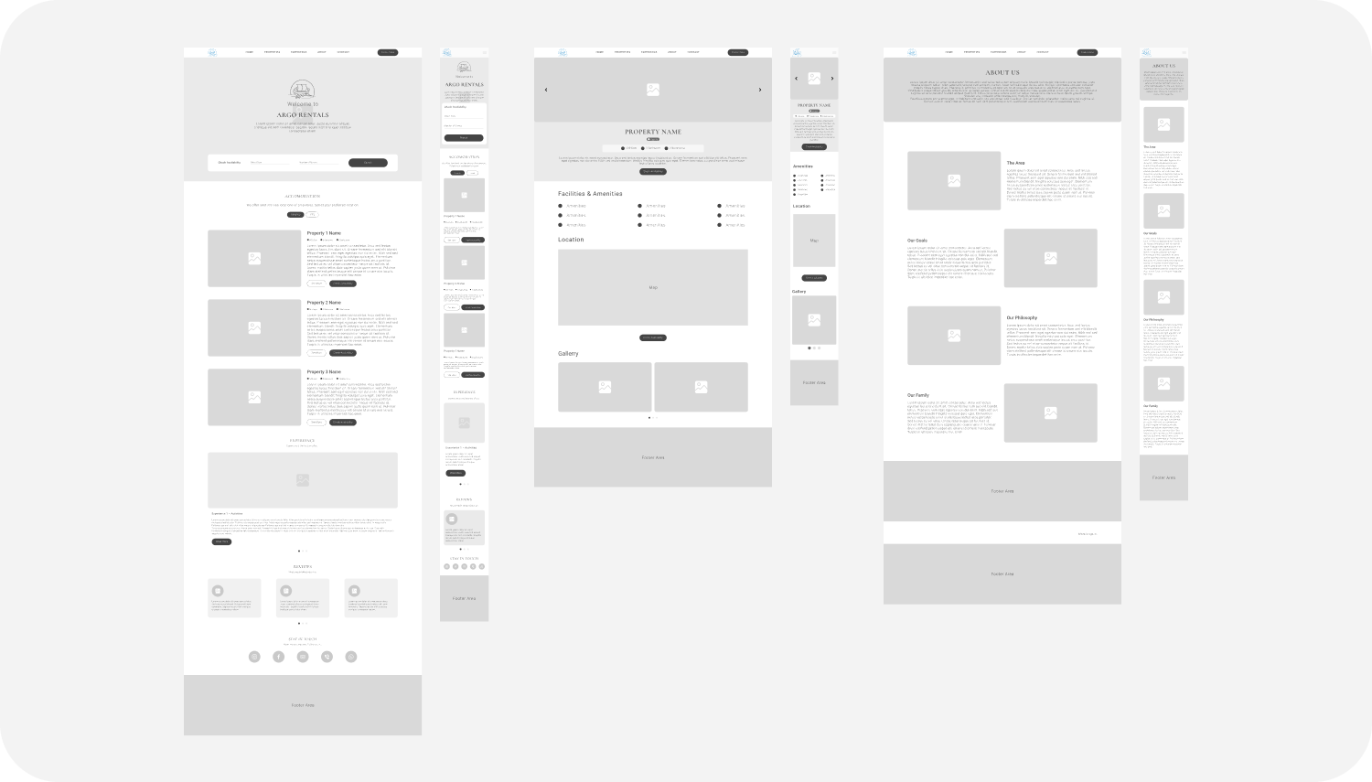
Decisions worth highlighting :
- Photography drives every layout. Wireframes were built around generous image space from the start, not as a retrofit. A holiday rental site that does not lead with imagery is fighting with one hand tied.
- Property cards lead with photo and nightly rate. No hidden pricing, no "request a quote to see availability." Removing that ambiguity built trust and reduced unqualified inquiries.
- The homepage tells a short story. Hero, then who we are, then a properties preview, then the area, then social proof, then contact. Each section answers one question a first time visitor is actually asking.
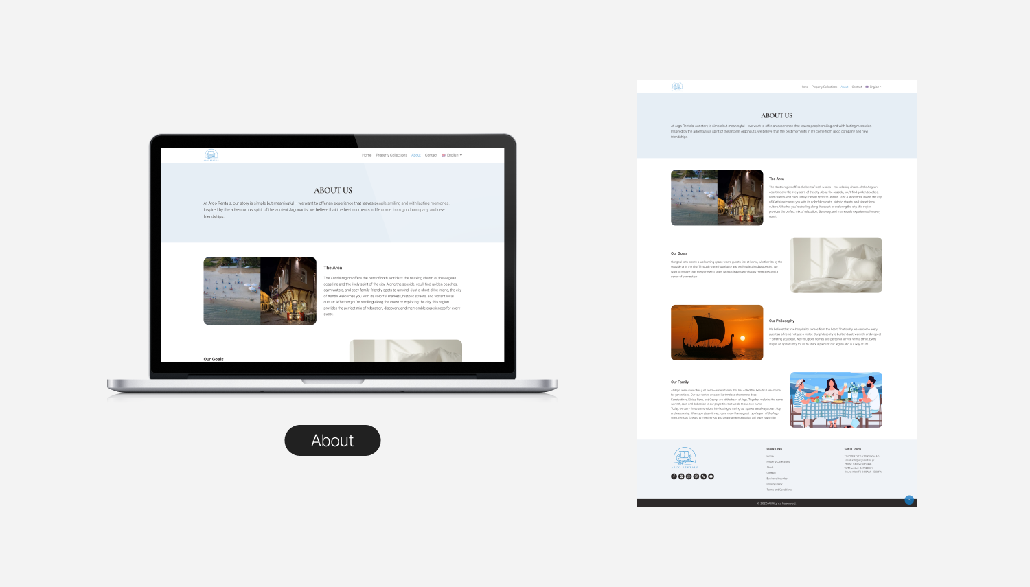
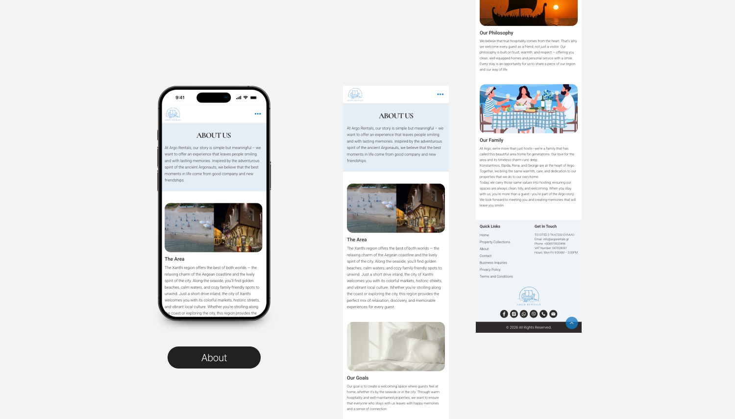
- The "About the family" page is a real page, not a footnote. For a family run business, this is a sales page, not an afterthought. It is where the brand's biggest competitive advantage lives.
- Mobile was wireframed first. Every layout was stress tested on a 375px frame before I touched the desktop version.
UI Design Approach
The visual language had to do two jobs at once. Feel modern enough to read as professional, and warm enough to communicate, "you're booking with people, not a platform."
Direction:
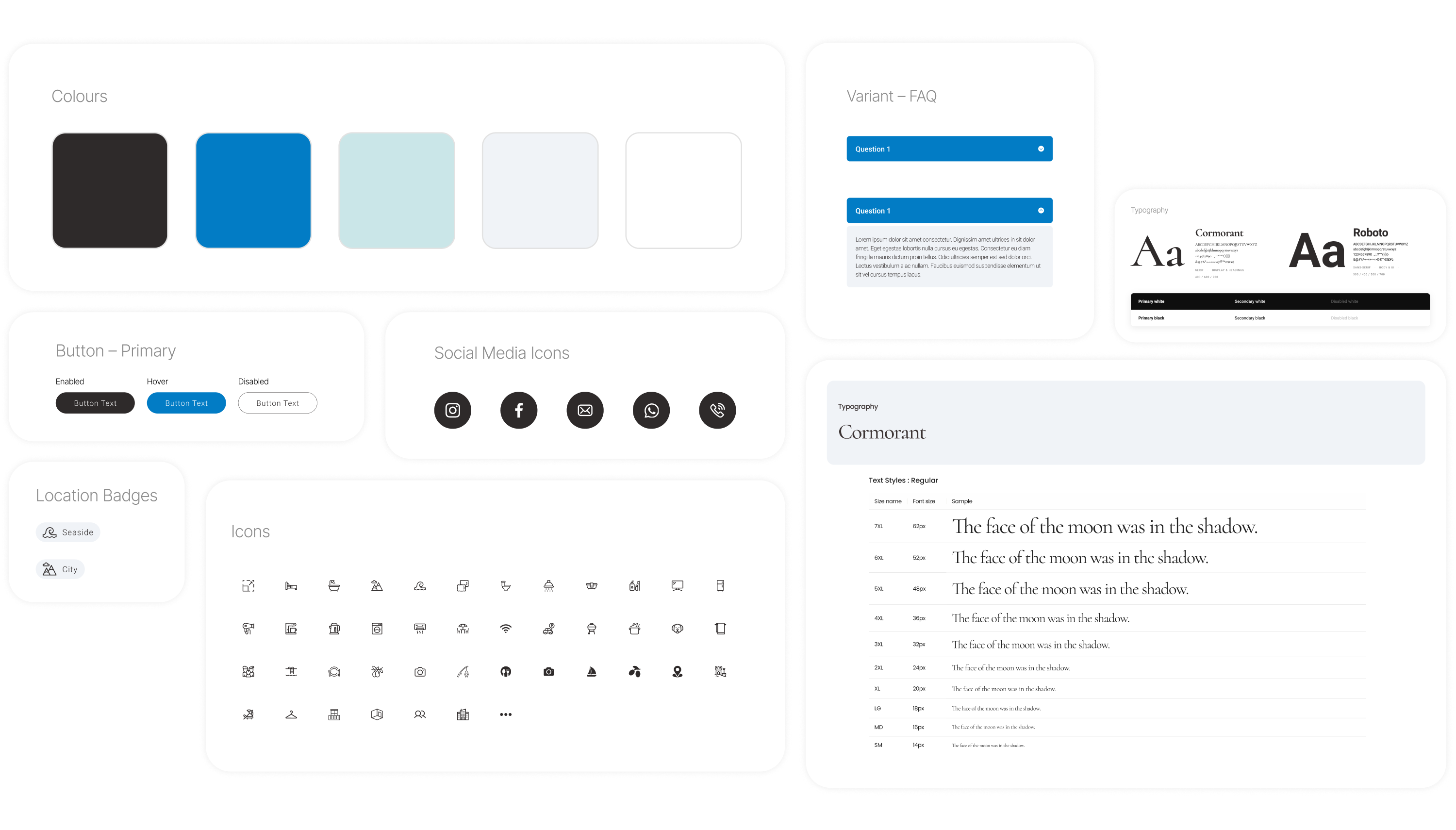
- A palette built around deep blue and warm sand, pulling from the colors of the wider region and the textures of traditional Thracian architecture, recognisable without leaning on cliché Greek flag iconography.
- Typography pairs a confident display face with a highly readable sans for body text, chosen for excellent rendering at small sizes on mobile and full character support across Greek, Latin, and Cyrillic, since the site ships in three languages.
- Photography forward layouts with generous breathing room. Real properties, real interiors, and real views from the actual windows. No stock imagery anywhere on the site.
- A consistent component library, including buttons, inputs, property cards, and info blocks, designed once and reused everywhere, so the build phase stayed efficient.
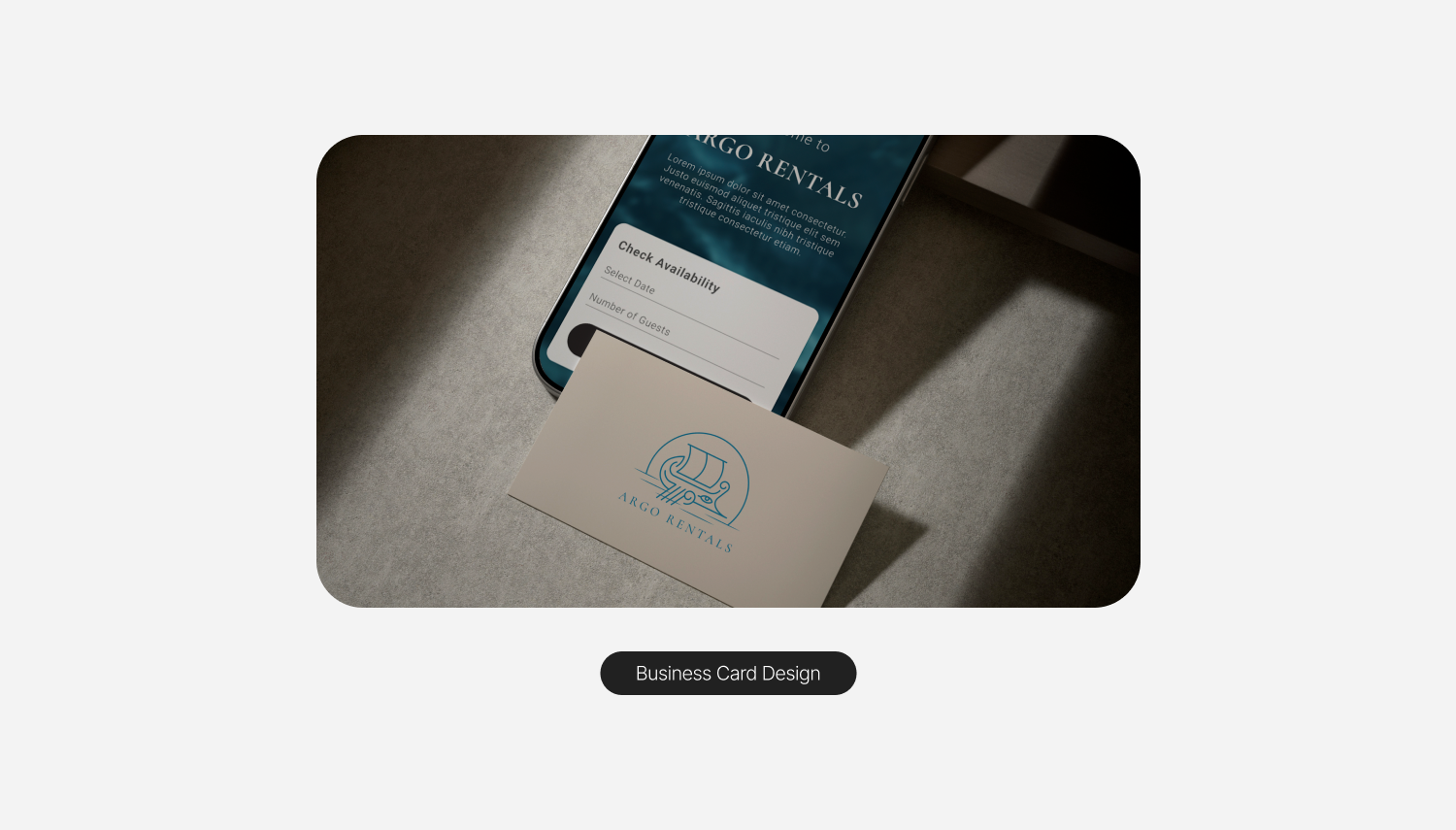
A logo system that picks up where the old one left off.
The previous identity built itself around the Argo, the mythical Greek ship the brand is named for, but the execution had aged poorly. The mark was illustrative and busy, sat on a flat orange disc, and was paired with a dated wordmark that did not survive at small sizes. Worse, it lived next to a different brand name in the footer ("Avdira Rentals"), so the identity contradicted itself before a guest had even scrolled.
The new logo keeps the conceptual thread the original got right, the Argo at sea, and modernises everything around it. The boat is redrawn in a single weight of clean linework. The sun sits behind it as a quiet halo, doubling as a reference to the Aegean sky. A small apotropaic eye, the traditional Greek mariner's symbol painted on real boats in this region, was added at the bow as a culturally specific detail that rewards a closer look. The palette unifies around the same blue used across the site, which finally puts the brand identity and the digital identity on the same page.
I built a full system around the mark for real production use. Across the rollout, nine logo variations covered every realistic application, including a primary lockup, a simplified mark for tight spaces and favicon use, a horizontal alternate, a stacked alternate, dark mode treatments, and monochrome variants. Each variation has a defined role rather than being a stylistic choice.
Design Review & Developer Handoff
Before any code, I walked the family through the full design and we iterated together over a few rounds of feedback, refining copy, photo placement, and a handful of layout decisions until every page felt right. Working directly with the client this closely was one of the real advantages of a small team setup, since decisions were quick and grounded in their actual knowledge of how guests behave. Once the design was signed off, I moved straight from Figma into WordPress.
The build itself stayed disciplined:
- Performance budget held. Image optimization, lazy loading, and a tight component library kept the site fast, which is critical for mobile users on travel data plans, especially on image heavy property pages.
- Trilingual structure done properly. The site ships in Greek, English, and Bulgarian, with language switching that preserves intent across pages and full localization of metadata, URLs, and form labels, not just visible text. The language layer was treated as a first class part of the build, not a translation pass at the end.
- Accessible by default. Color contrast, focus states, semantic structure, and keyboard navigation were built in from the start.
- Editable by the family. The CMS is structured so the family can update properties, photos, rates, and availability without touching anything fragile. The site has to live with them, not depend on me.
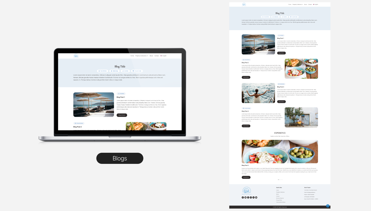
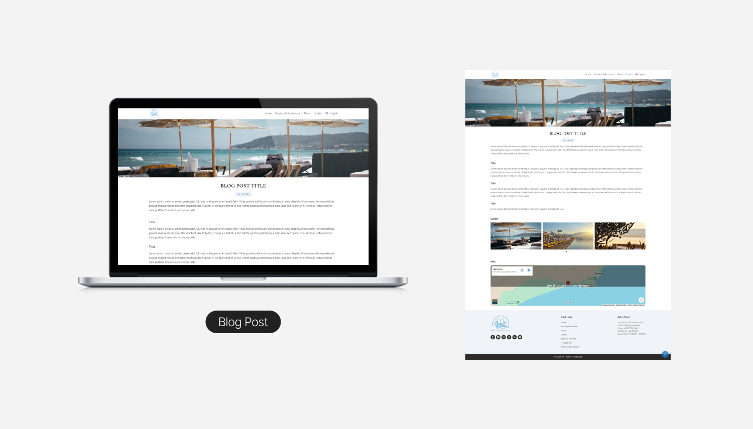
Final Design Overview
A walkthrough of the moments that mattered. A few screens did most of the heavy lifting in the experience. Each was designed around a specific question the user was asking at that point in their journey.
Outcomes & Reflections
The site launched in early 2026 and gave Argo Rentals something they had not had before: a sales channel they fully own, and a brand that finally matches the way they actually host.
Hard metrics are still pending, since the project is too young to have a full season of analytics behind it. The qualitative signals so far have been the strongest a designer can ask for at this stage:
- The family loves it. The site finally feels like them, in a way the previous design never did. They are using it actively as part of how they introduce themselves to new guests, which is exactly the role it was designed to play.
- It works across generations. Family members ranging from 25 to 65 were able to navigate the site, find what they needed, and complete an inquiry without help. Cross generational usability matters more than usual for this audience, where trips are often planned by mixed age groups, and clearing that bar across a 40 year range was a deliberate design goal from the start.