Overview
A self initiated experiment in AI assisted product building. Photobooth is a small, live, single purpose web app that turns a few seconds in front of a webcam into a four frame keepsake. Designed and shipped end to end in v0, deployed on Vercel, with the code pushed to GitHub as practice with the full workflow.
Project :
Photobooth
Role :
Sole Designer & Builder
Project Type :
Personal Side Project
Platform :
v0, Vercel, GitHub
Focus :
Vibe Coding Experiment
The Challenge
Could I ship a real product, end to end, with vibe coding alone?
I had been reading about vibe coding for months without trying it. The promise was that a designer could go from idea to live product with an AI tool like v0, without hand writing the code. I wanted to test that for myself, but I wanted to do it properly. Not a throwaway demo, but a real working app that someone could actually use and want to come back to.
The trick was picking a scope small enough to ship in a weekend, but interesting enough to teach me something. I landed on a four frame photo booth because the format is tightly constrained (always four photos, always a strip) while the details around it (capture flow, output styling, sharing) leave plenty of room for design decisions. The constraint became the brief.
Objectives
Before starting, I set a few clear targets for the experiment. The point was not just to ship a photo booth. It was to use the photo booth as the excuse to learn what vibe coding can actually do in the hands of a designer.
Learning objectives:
- Use v0 to take a project from prompt to live URL, end to end, without writing code by hand.
- Practice the full workflow, including deploying on Vercel and pushing the codebase to GitHub.
- Find the limits of vibe coding through real use, not theory. Where does it shine, and where does it ask too much of the designer in the prompt?
Product objectives:
- Ship a real, finished product, not a prototype or a tech demo. Something a friend can open on their phone and use without instructions.
- Keep the scope tight. One core flow, one tangible output (a four frame strip), no creep.
- Make it usable in under a minute, from landing on the URL to downloading a finished strip.
Design objectives:
- Resist the obvious photo booth tropes. No heavy retro filters, no polaroid frames, no novelty styling.
- Let the format itself do the nostalgic work and keep everything else calm and modern.
- Use restraint as a design choice. Two output styles, not twelve. One progress bar, not five animations.
UI Design Approach
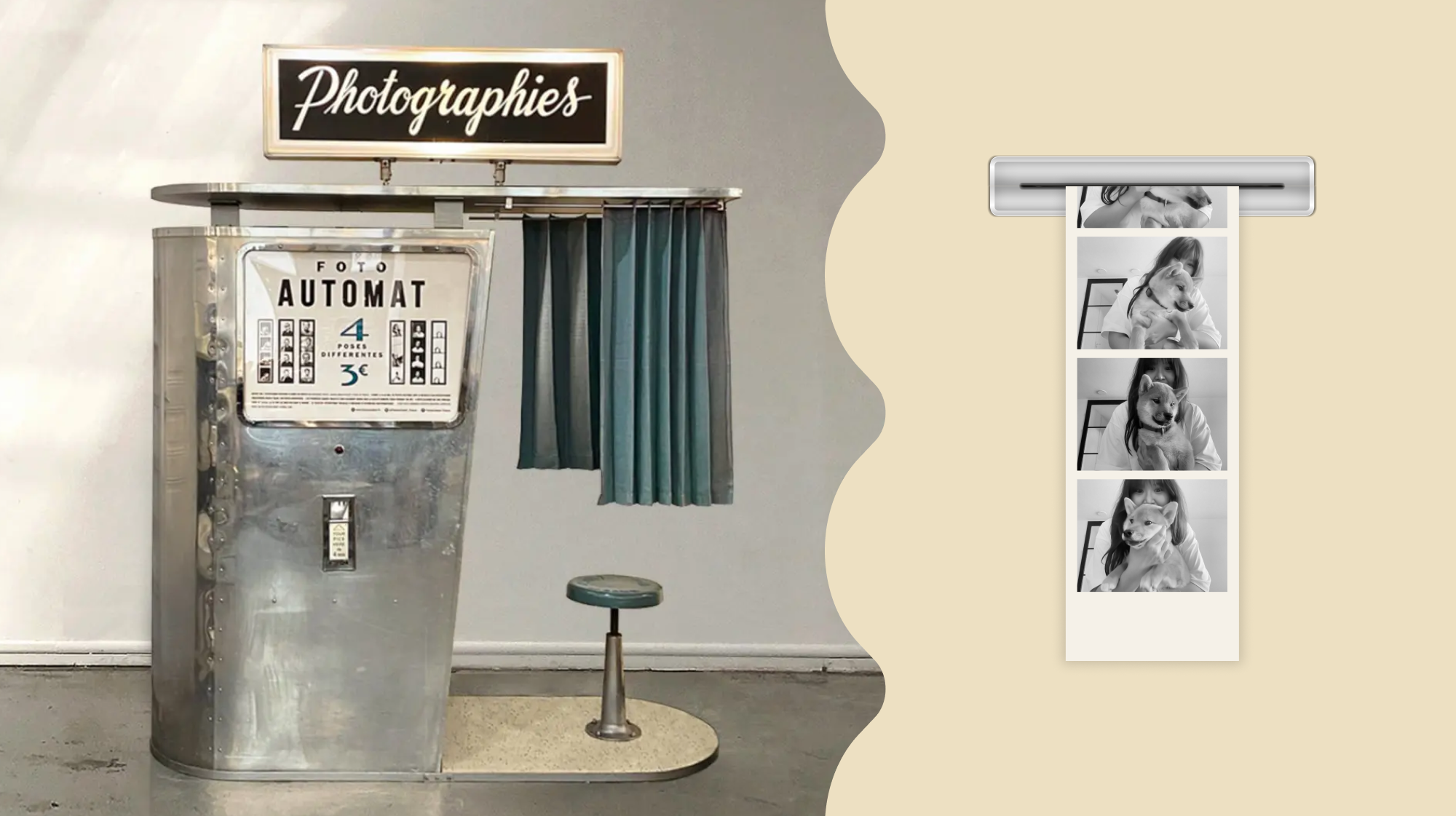
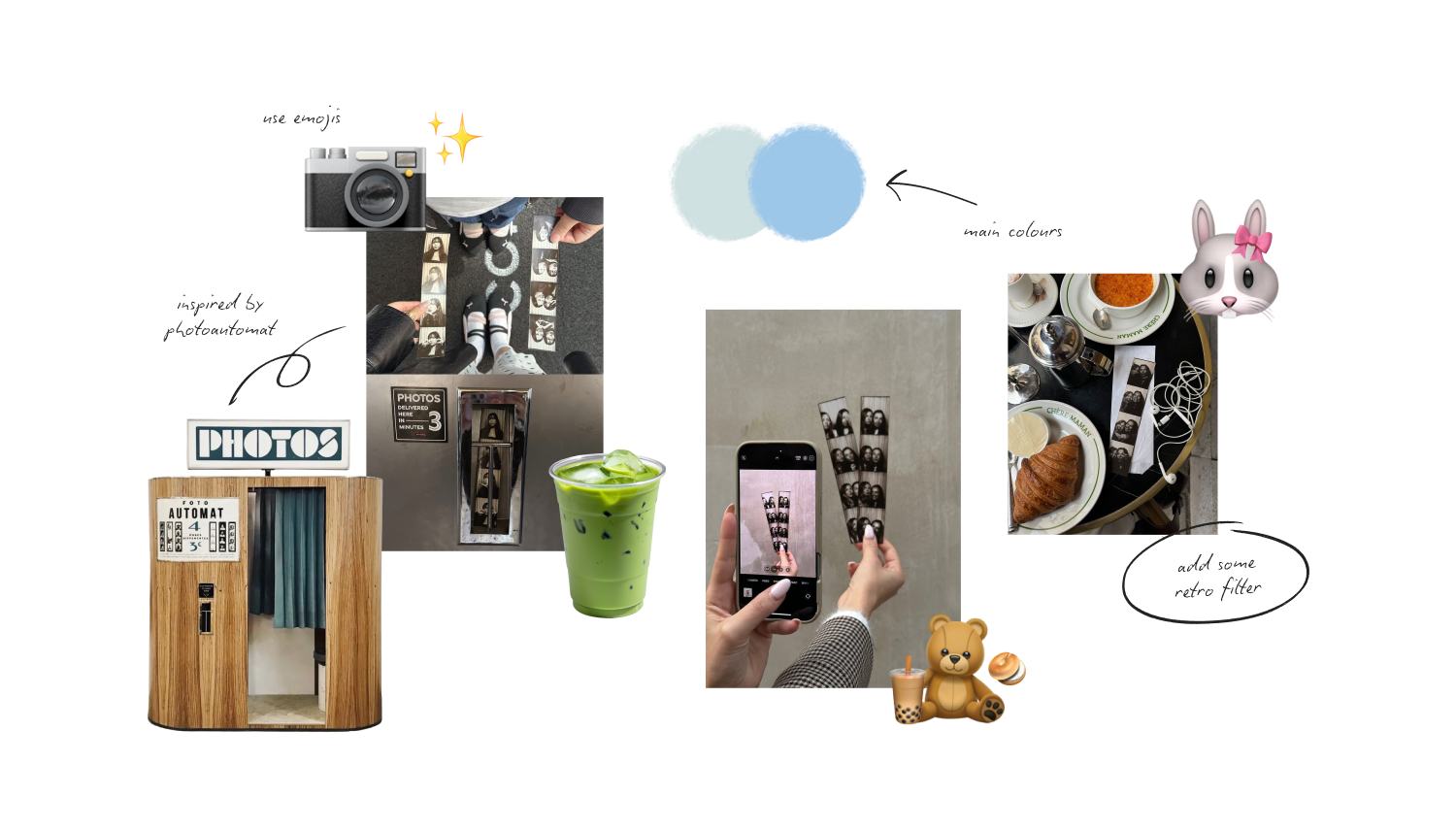
Most photo booth apps lean hard on retro. Heavy grain, vintage filters, sepia, polaroid borders, the whole 90s shelf. I went the other way. The format itself, a four frame strip, already carries enough nostalgia on its own. Piling more on top would have tipped the design into pastiche.
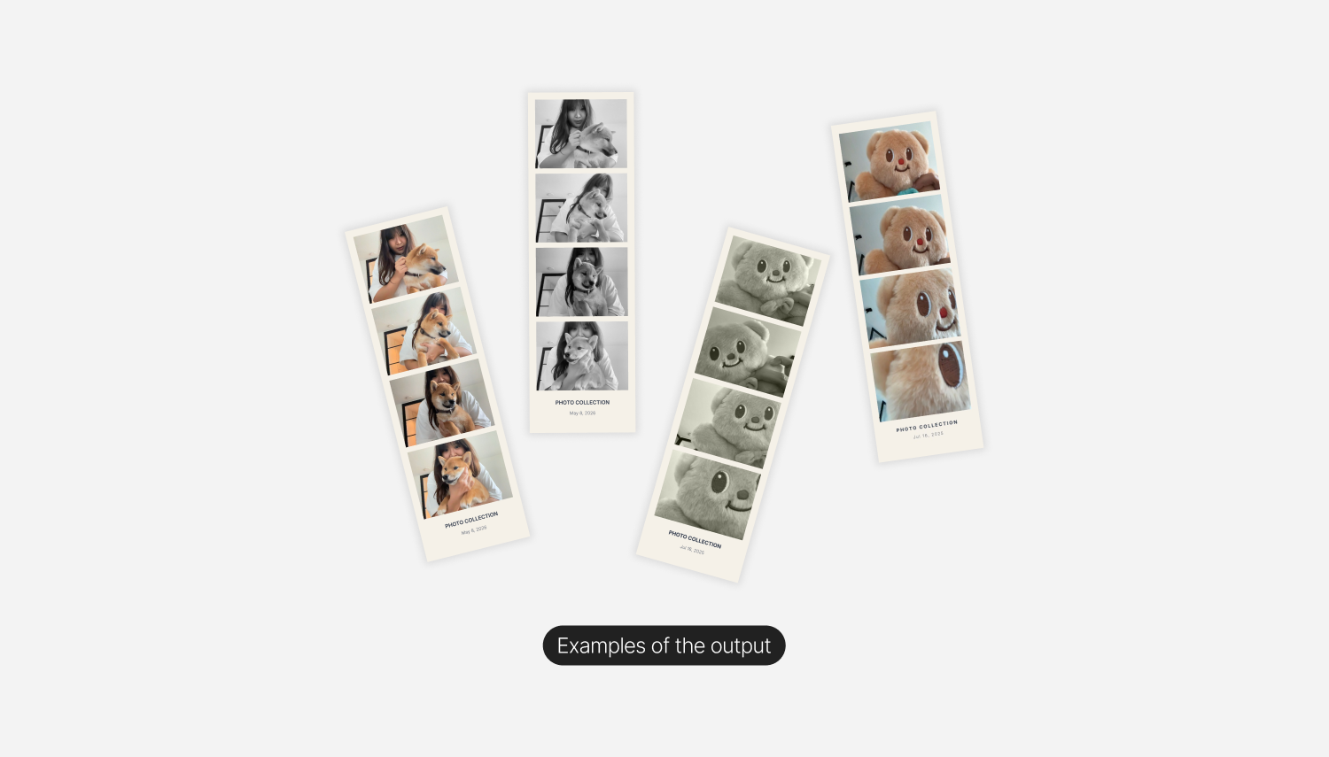
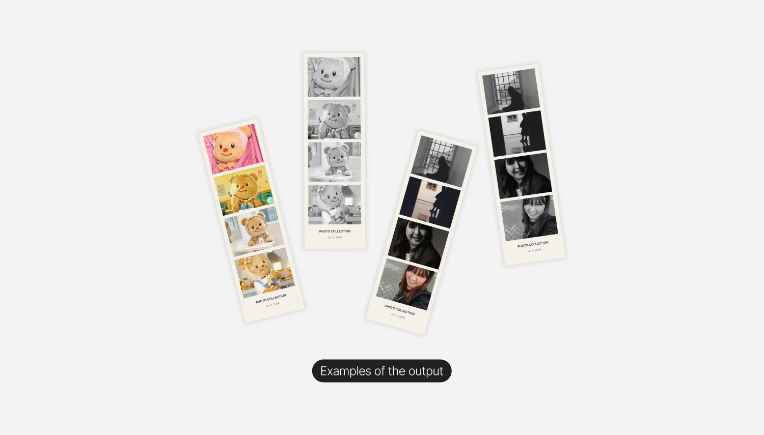
The direction was modern, soft, and calm. A pale blue and cream palette that reads as keepsake rather than novelty. A scrolling marquee of quiet phrases (curate your story, design your vision, shine bright) running across the top to set the tone. A small cloud sliding along the progress bar as a low cost moment of delight. Only two output styles (Natural and Monochrome) instead of a dozen filters, because the discipline of constraint felt right for a tool whose entire identity is "four frames."
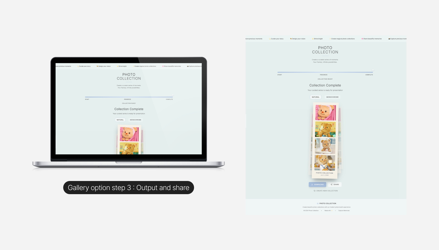
The final artifact, the strip itself, sits centered on a soft background with a date stamp at the bottom and a subtle stack of duplicates behind it, so the moment feels like a real, downloadable object rather than a screenshot.
Design Review & Developer Handoff
The product was built entirely in v0. No external Figma file, no separate dev handoff. I prompted, reviewed, prompted again, and iterated on the live build directly. That workflow changes how design decisions get made. There is no friction between design and code, which is freeing, but there is also no built in checkpoint to slow down and think. That checkpoint has to come from somewhere else, usually from your own discipline.
I treated each round of prompts the way I would treat a Figma iteration. Set the intention, look at the result with fresh eyes, edit. The "fresh eyes" step is the one that matters most with AI assisted building, because the model is generous and will give you something workable on the first try. The job is to keep raising the bar from there rather than accepting the first thing that works.
Once the design felt right, I pushed the code to GitHub. The product was already live on Vercel, so the GitHub step was about practice rather than necessity. I wanted to navigate the full developer side of the loop properly, even on a small project, because that is increasingly part of the designer's job.
Final Design Overview
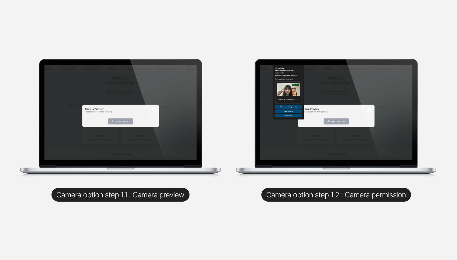
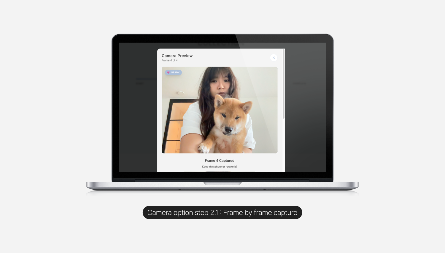
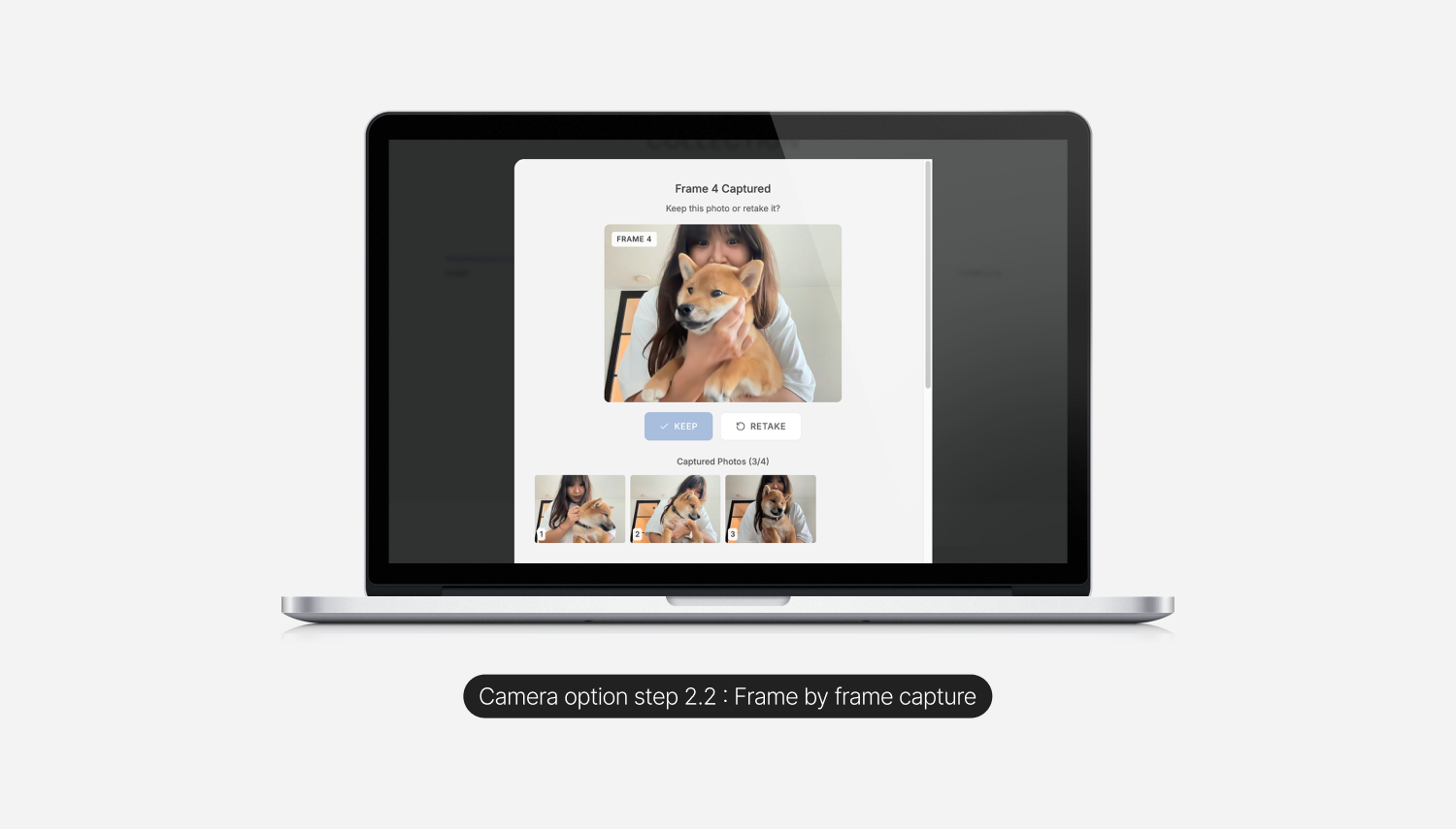
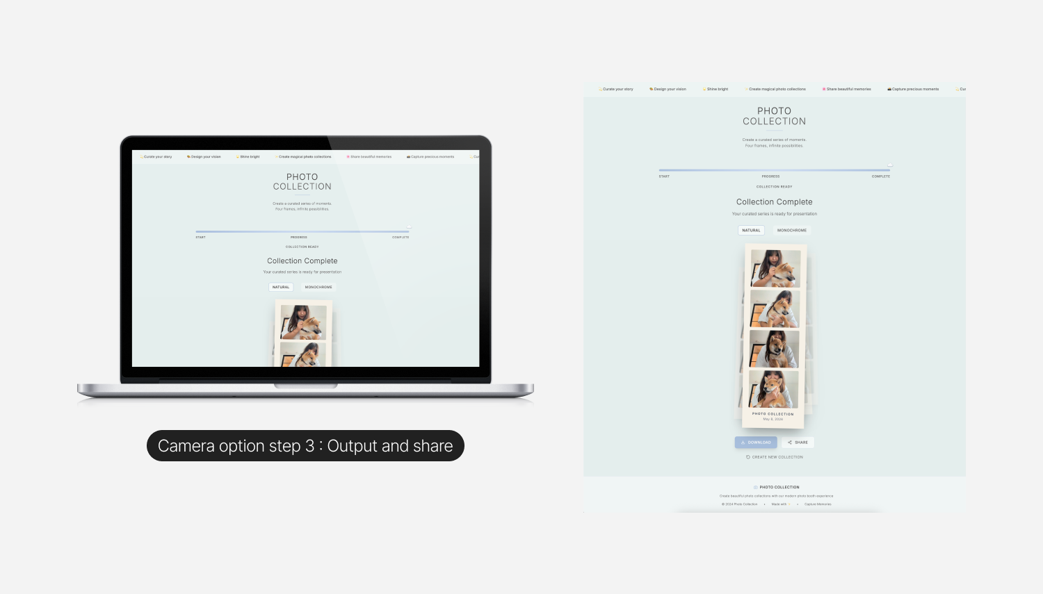
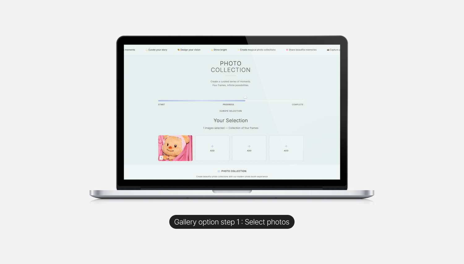
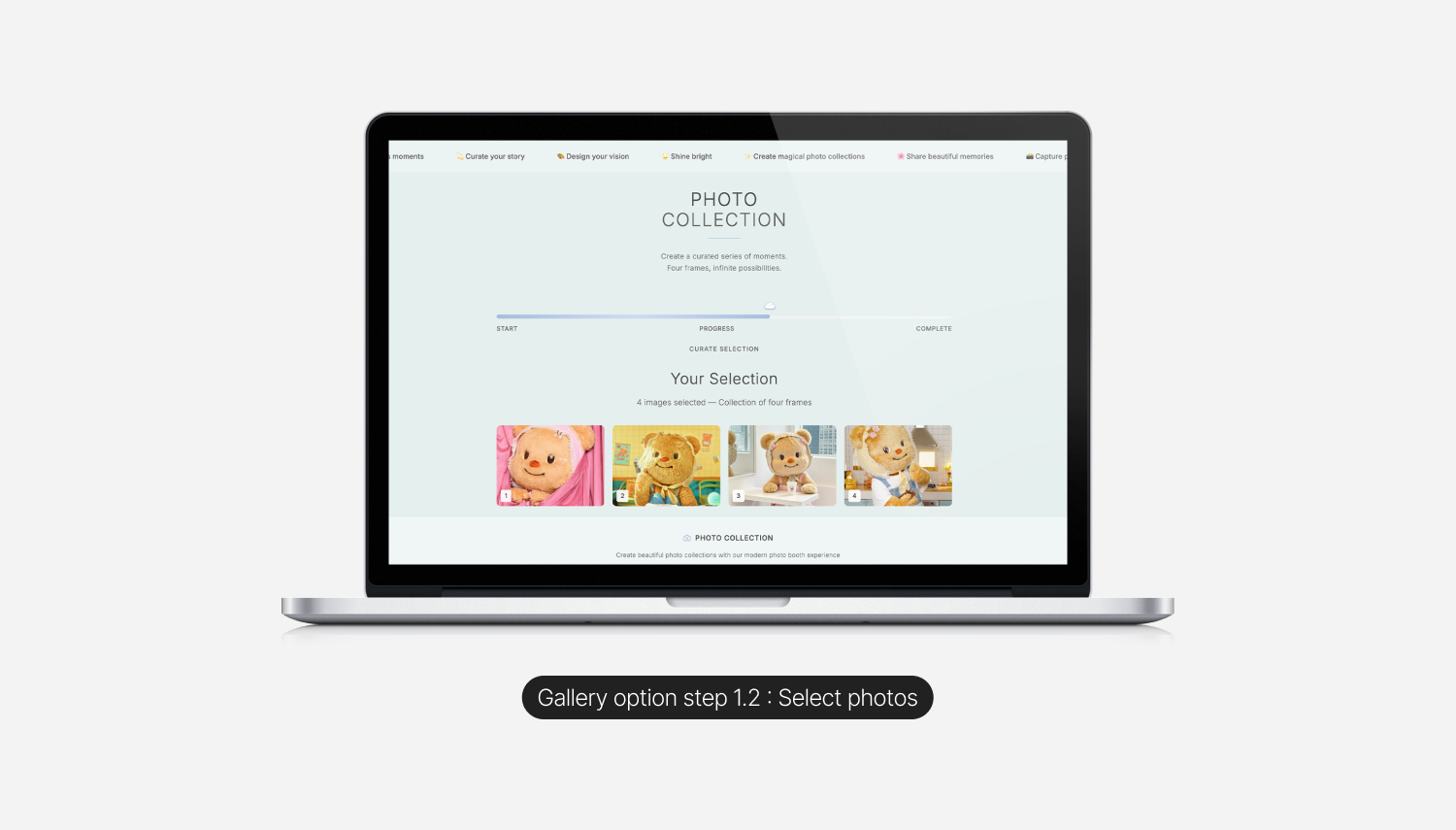
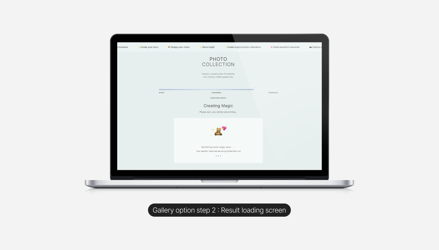
The product is one short flow with two entry methods. The Camera path captures four frames live through the webcam with a keep or retake choice at every step, mirroring the rhythm of a real booth. The Gallery path lets users pick four photos from an existing gallery and treats the loading state as part of the experience rather than a throwaway skeleton ("Sprinkling some magic dust," with a small bear and sparkles illustration). Both paths converge on the same final output: a four frame strip on a soft canvas with a date stamp, a Natural or Monochrome toggle, and a subtle stack of duplicates behind it, so the result reads as a real, downloadable object rather than a screenshot.

Outcomes & Reflections
I sent the live link to a handful of friends. They used it. They said it was fun. The feedback that stuck with me most was that it was simple, which in the context of an AI tooling experiment is the right compliment. Most vibe coded projects get bloated quickly, because the tool removes the natural cost of adding features. Restraint becomes the design choice.
What I would do next:
A few directions feel interesting from here. A real audio cue and countdown before each capture, to copy the rhythm of a real booth more closely. A custom border or sticker layer for the final strip. A small library of styling presets beyond Natural and Monochrome. A way to print directly, so the digital artifact can finish as a physical one.
What I took away:
Vibe coding is real. It changes the texture of the design process more than it changes the output. The output can still be opinionated, restrained, and well crafted. The difference is that the path from idea to live thing is short enough that you can afford to ship more often, and shipping more is its own form of design education. Working with v0 taught me to treat prompts as a design tool in their own right, with the same care I would give to a layout. The best prompts are not the longest ones. They are the most specific.