Design System Showcase
Overview
A colour, typography, and component foundation built to unify a product that had none. It brings web, native app, and collateral onto the same visual language.
Project :
Design System Showcase
Role :
Product Designer
Project Type :
Design System
Platform :
Figma, Figma Variables
Focus :
Colour system, typography system, core components, design tokens
The Problem
I was asked to help fix a set of product problems for a team that was growing fast but had never built a shared design language. Web and native app used different hex values for what was meant to be the same brand colour. There was no defined type scale, so hierarchy was inconsistent from screen to screen. And with no single source of truth, developers were left guessing. They ended up recreating the same button or input slightly differently every time it showed up, which slowed the build down and widened the gap between design and what actually shipped.
None of this could be fixed by designing more screens. The fix had to happen one level down, at the level of the basics every screen depends on.
Approach
Rather than adding another screen to the pile, I started from the decisions that every other decision depends on: colour, type, and a small set of core components. Getting these right first meant every new feature and every surface built afterward, app, web, or print, would inherit consistency automatically, instead of needing to be corrected after the fact.
- Audited existing colour usage across web and app to find where the same "brand colour" had quietly split into multiple hex values
- Built a neutral scale first for structure and text, then layered in semantic colours (success, error, warning, info) and a broader accent palette
- Built the type scale around consistent, predictable steps so any new screen could be composed from existing styles instead of one-off sizes
- Defined a small set of core components, icons and buttons, that carry the colour and type system into real, reusable UI
- Tokenized the system as Figma Variables, so the same colour and type decisions could be referenced identically in Figma and handed off directly to development
- Worked through a proper design-to-dev handoff, so the system wasn't just documentation. It was the thing developers actually built from
Principles
A short set of rules the system follows, so decisions stay consistent even as new people and new screens get added to it.
- One accent, not many. Sky is the only colour used to draw attention or signal interactivity. If everything is trying to stand out, nothing does.
- Semantic colours are never decorative. Red, orange, yellow, and green mean error, warning, caution, and success, only. They don't get borrowed for branding moments or visual variety, so their meaning stays trustworthy everywhere they appear.
- Scale and weight carry hierarchy, not new typefaces. One typeface, Inter, does the entire job. Hierarchy comes from size and weight, not from switching fonts to signal importance.
- Every token has one job. A colour or type style is defined once, for one purpose, and reused, rather than a new value being created each time something looks close enough.
- Contrast is checked, not assumed. Every text and background pairing in the system is tested against WCAG before it's approved, not chosen by eye.
- If it's not tokenized, it's not in the system. Anything used in production has to trace back to a defined token. That rule is what keeps design and development looking at the same source of truth.
Colour System
A layered colour system. A neutral foundation for structure and text, semantic colours for status and feedback, and a broader palette for accent use.
Neutral foundation
- Base: White
#FFFFFF, Black#000000 - Neutral scale, 50 to 900:
#EFEFF0, #CDCED0, #B5B7B9, #949699, #7F8185, #5F6267, #56595E, #434649, #262626, #0A0A0A
Palette (8 hue families, 10 shades each, 50 to 900)
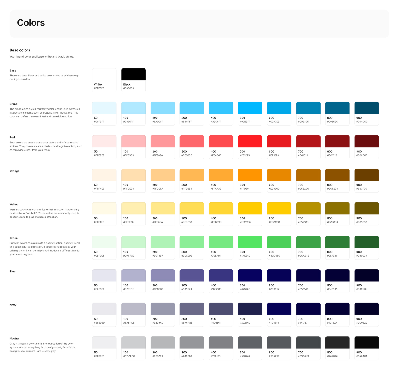
Usage guidance:
- Sky is the primary accent, used for interactive elements and brand moments. Red, orange, yellow, and green are reserved as semantic colours: error, warning, caution, and success, so status is always recognizable at a glance, regardless of context.
- The 500 step and darker hold up well against white for text and icons. Anything lighter than 400 is meant for backgrounds and fills, not for content that needs to be read.
- Tints (50 to 200) are for backgrounds, hover states, and subtle fills. Mid-tones (300 to 600) carry the primary interactive and brand weight. Dark shades (700 to 900) are reserved for text on light backgrounds and high-contrast states.
Typography System
A single typeface, Inter, carries the entire system. Display and body styles are set apart by scale and weight rather than font family, keeping the interface visually unified.
Type families: Inter (headings), Inter (body)
Display scale (headings), each available in Regular, Medium, Semibold, and Bold:
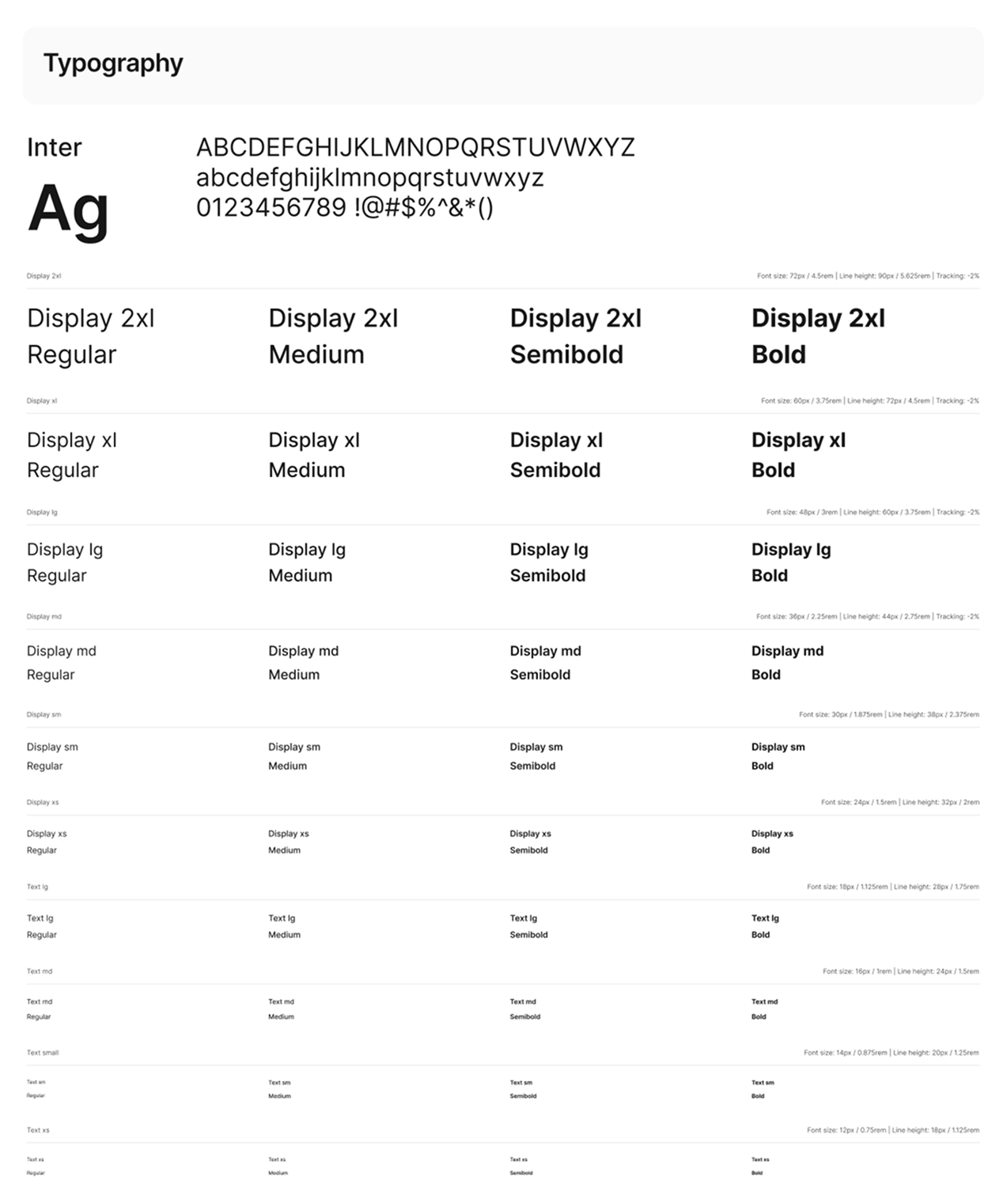
Usage guidance:
- Display 2xl and Display xl are reserved for hero headlines and top-level page titles. Display lg through xs step down through section headings and card titles as hierarchy narrows.
- Semibold is the default for emphasis across the system. Bold is used sparingly, for the rare moment something needs to outrank everything else on the screen.
- Text md/Regular is the default for body copy. Text sm and Text xs handle captions, labels, and metadata. The smallest sizes never carry primary content.
Components
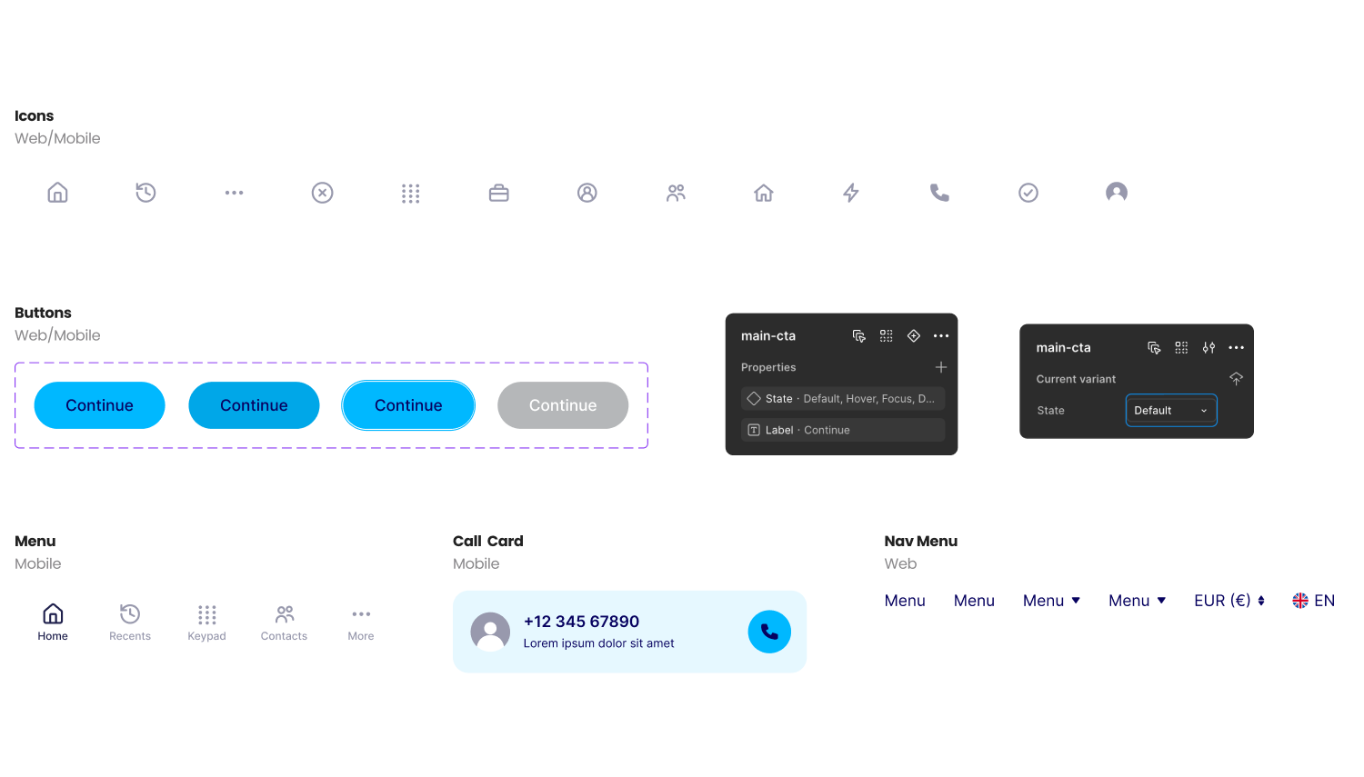
Some examples of a small, focused set of core components shows the colour and type system working in practice, not just sitting in a style guide.
Icons
A consistent icon set built on a shared grid and stroke weight, so every icon reads at the same visual size and density regardless of what it represents.
Usage note: Icons pair with the neutral and semantic colors above rather than introducing new ones. Default state uses a neutral tone; active or semantic states borrow directly from the palette.
Buttons
A single button component shown across its core states: default, hover, focus, and disabled. Copy is generic ("Buy now" or "Continue") so the focus stays on the system, not the product.
Usage note: States are built from the same color tokens defined above, not one-off values. Hover and focus states are darker or outlined variants of the base color, and disabled uses a neutral tone at reduced contrast, keeping every state traceable back to the same palette.
Token Architecture
Colours and sizing are not just picked, they are structured. Every value moves through three tiers before it reaches a screen, so meaning and context are never lost between design and code.
The system is organized as three tiers of Figma Variables, moving from raw value to real-world use:
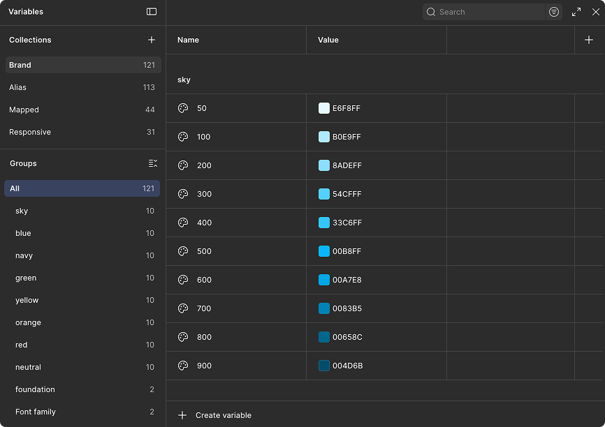
1. Brand, the primitives (121 variables)
The raw building blocks: full colour ramps for every hue, and a raw numeric sizing scale. Nothing here carries meaning yet, it is just the palette of possible values.
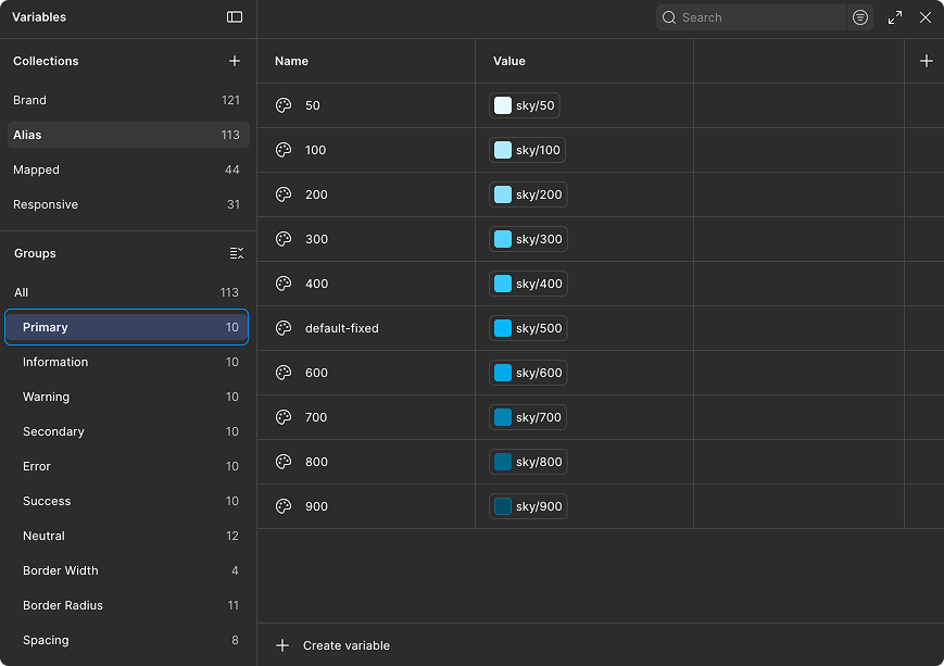
2. Alias, the semantic layer (113 variables)
Raw values get grouped by intent. Colours are organized into purpose-based groups (Primary, Information, Warning, Secondary, Error, Success), each with its own 10-step scale. Raw sizing is renamed into a familiar T-shirt scale (xxs through xxxl). This is the layer where a value stops being "just a hex code" and starts meaning something.
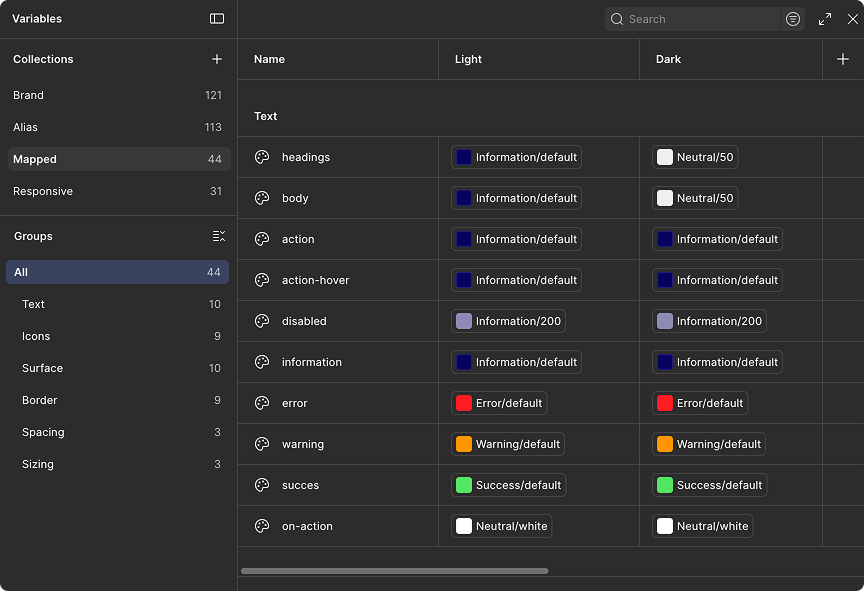
3. Mapped, the context layer (44 variables)
Semantic tokens get tied to actual usage: text/headings, text/body, text/action, text/disabled, icon/default, surface/default, border/default, plus spacing and sizing tokens. Every Mapped token carries both a Light and a Dark value natively, so dark mode was never an afterthought bolted on later, it was part of the structure from the start.
4. Responsive (31 variables)
The same context tokens adapted across breakpoints, so spacing and sizing stay correct as screens change size, without a designer or developer having to re-derive values by hand.
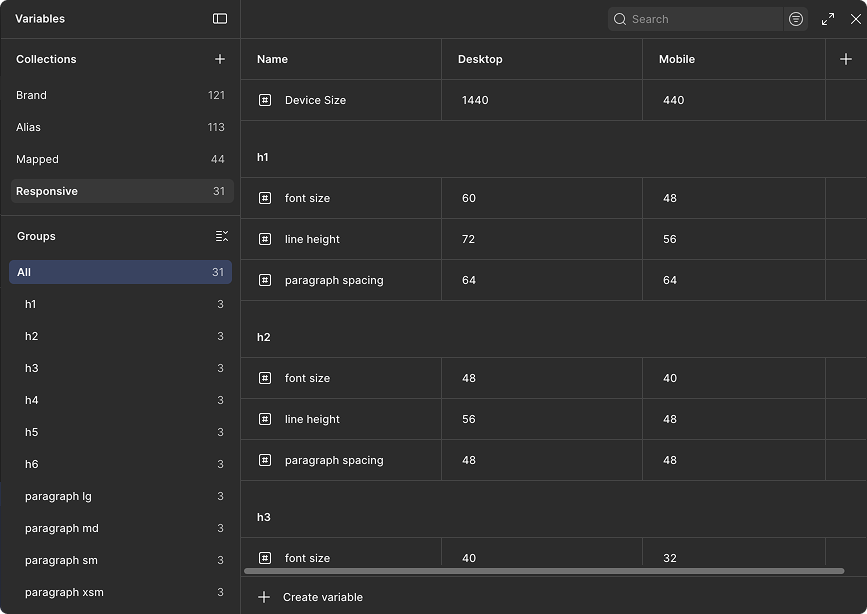
Why it matters: A developer building a component never touches a raw hex code or a raw pixel value. They reference a Mapped token, like text/error or spacing/md, and the correct colour, contrast, and mode are already resolved underneath it. Change a single Brand primitive, and it flows correctly through Alias, Mapped, and Responsive without anyone having to update forty separate places by hand.
What it enables
This system was built to solve the problem at its root, not patch individual screens. One shared source of truth for colour, type, and core components means web and native app no longer drift into different hex values for the same brand colour. There is one number, referenced everywhere. The same foundation extends cleanly to collateral and ads, so anything printed or published outside the product still reads as the same brand. And for the development team, the token structure removes the guesswork. Instead of eyeballing a colour or re-deriving a font size for every new component, they are building from a system that has already been decided.
Accessibility callout:
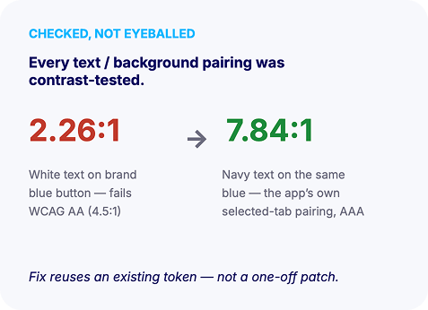
Every text and background pairing in the system was tested against WCAG contrast requirements, not chosen by eye. One example: white text on the brand blue token came out to 2.26:1, well under the 4.5:1 minimum for WCAG AA. Switching that pairing to navy text on the same blue brought it to 7.84:1, passing AAA, using an existing token rather than a one-off patch.
Design Review & Developer Handoff
Having the system in place changed how both design review and developer handoff worked. Design reviews became faster, since feedback could focus on whether the right token was used rather than debating one-off values. Handoff followed the same shift: developers worked directly from the token structure instead of interpreting a static style guide, which cut down on back-and-forth and kept what shipped closer to what was designed.